

Stop Doing This in Graffiti – Simple Fixes for Clean Style
Easy Throwie Tips
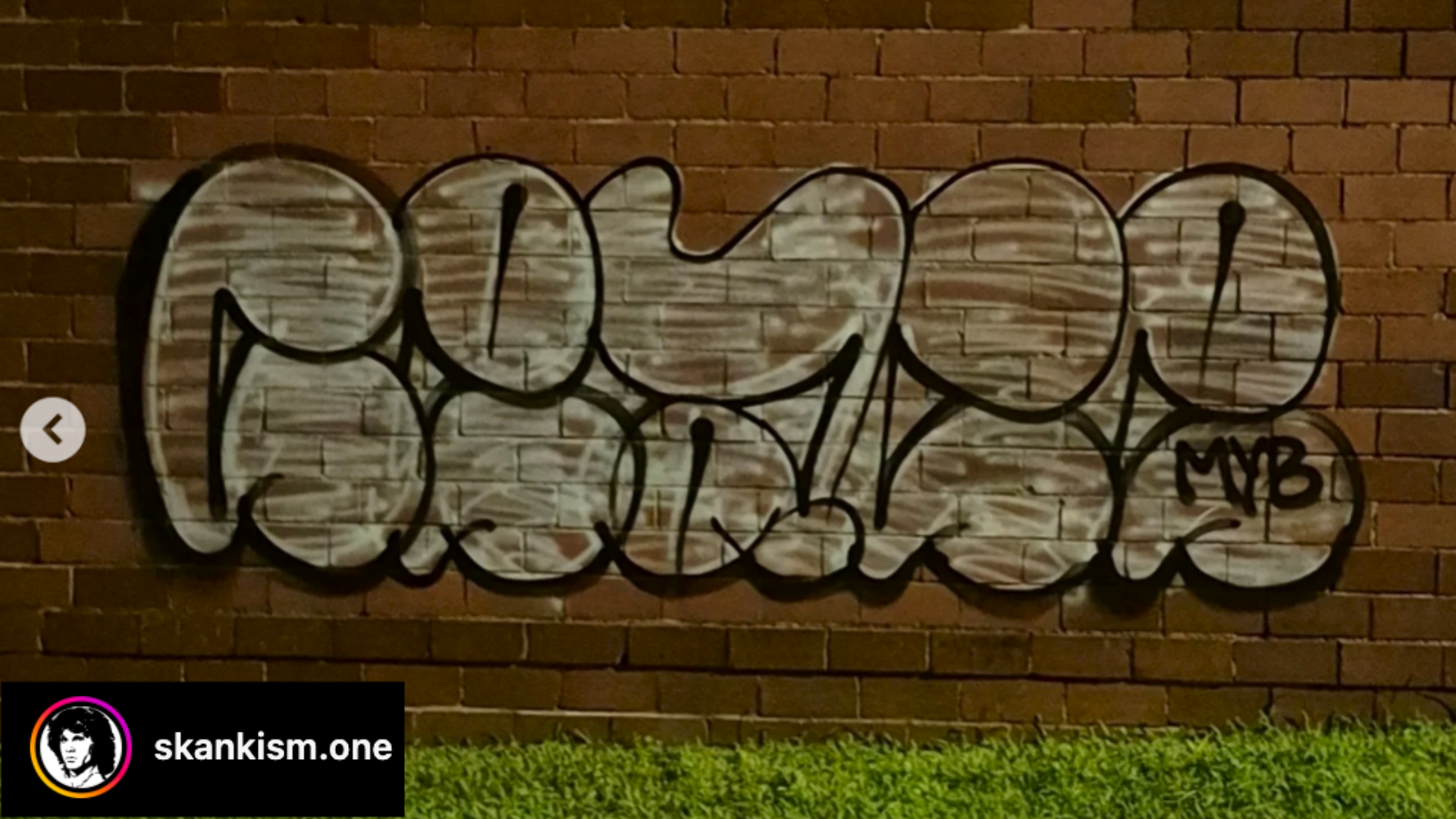
We kick off with a submission from Ceace, who submitted a classic basic throwie. Right off the bat, there’s a lot to appreciate—his letters are well-proportioned and the flow feels natural. But once we look closer, some key areas for improvement emerge.
Letter Identity
The most noticeable issue is in the letter “C.” It’s shaped like an “S” that it causes confusion due to a swooping line at the bottom that doesn’t occur naturally on the C. This is a common problem for beginners: if your letter shape gets too stylized, it loses its identity. In graffiti, especially throwies, each letter needs to be recognizable, and that requires us to refine our structures.
Overlaps
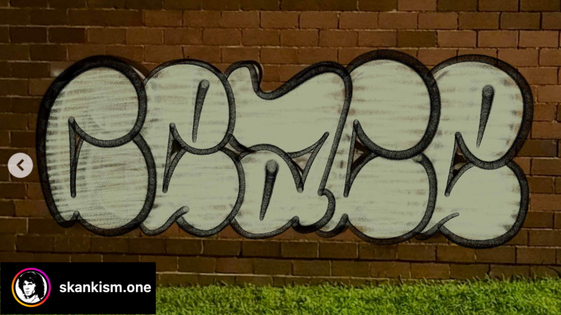
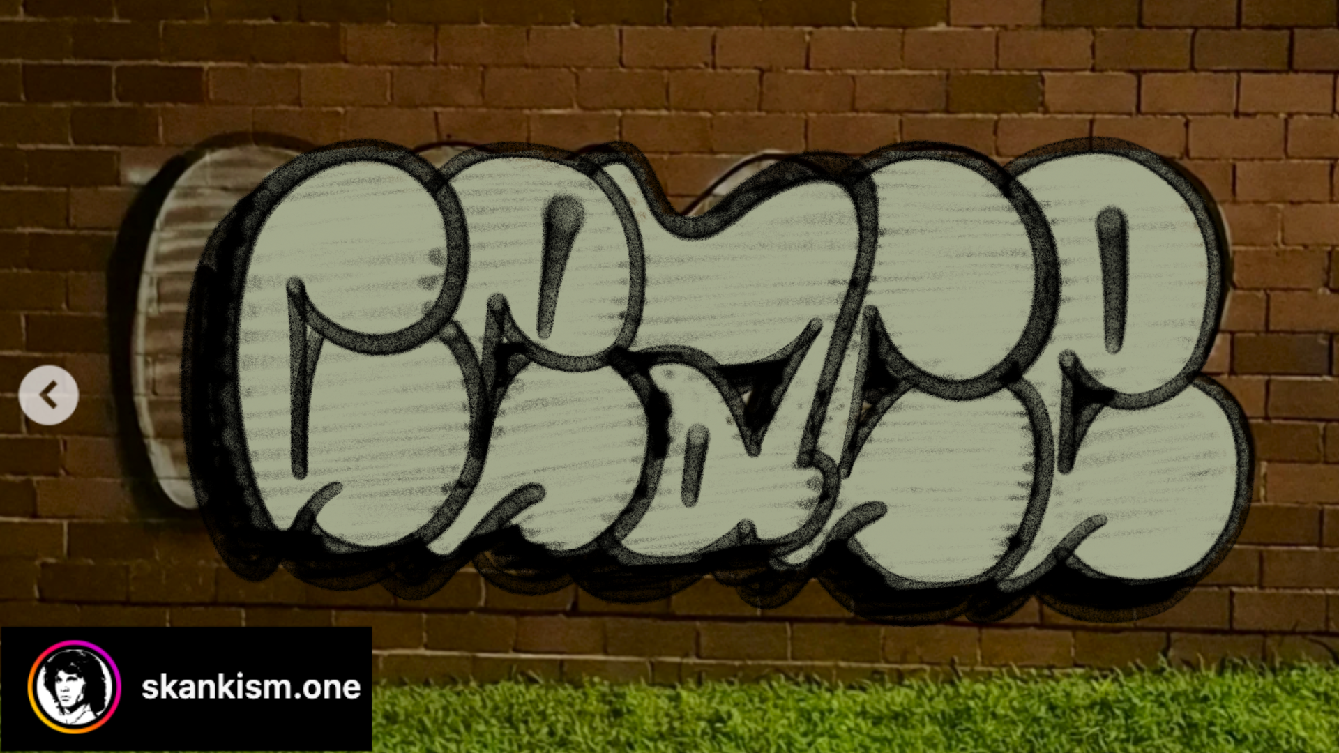
Some overlaps in this throwie are pretty deep, and others are very shallow overlaps. We want to make the overlaps a little more uniform. Making the overlaps more alike brings added cohesion to the throwie over all and can even allow us to reestablish structure (such as in his E) that we previously covered. We can see this in the middle image, where making the overlaps more shallow helped structure a bit. On the other hand, we can take things the other direction and make the overlaps consistently deep, and doing this certainly does decrease structure, but if our structures are refined enough, then we may still be able to have a functioning throwie (last photo).
Fixes and Recommendations:
Clarify the “C”: Keep the flow but shift its curve to avoid it looking like an “S.”
Improve overlap: Position each letter so the overlaps feel intentional and consistent.
Stop THIS from Happening to Your Graffiti
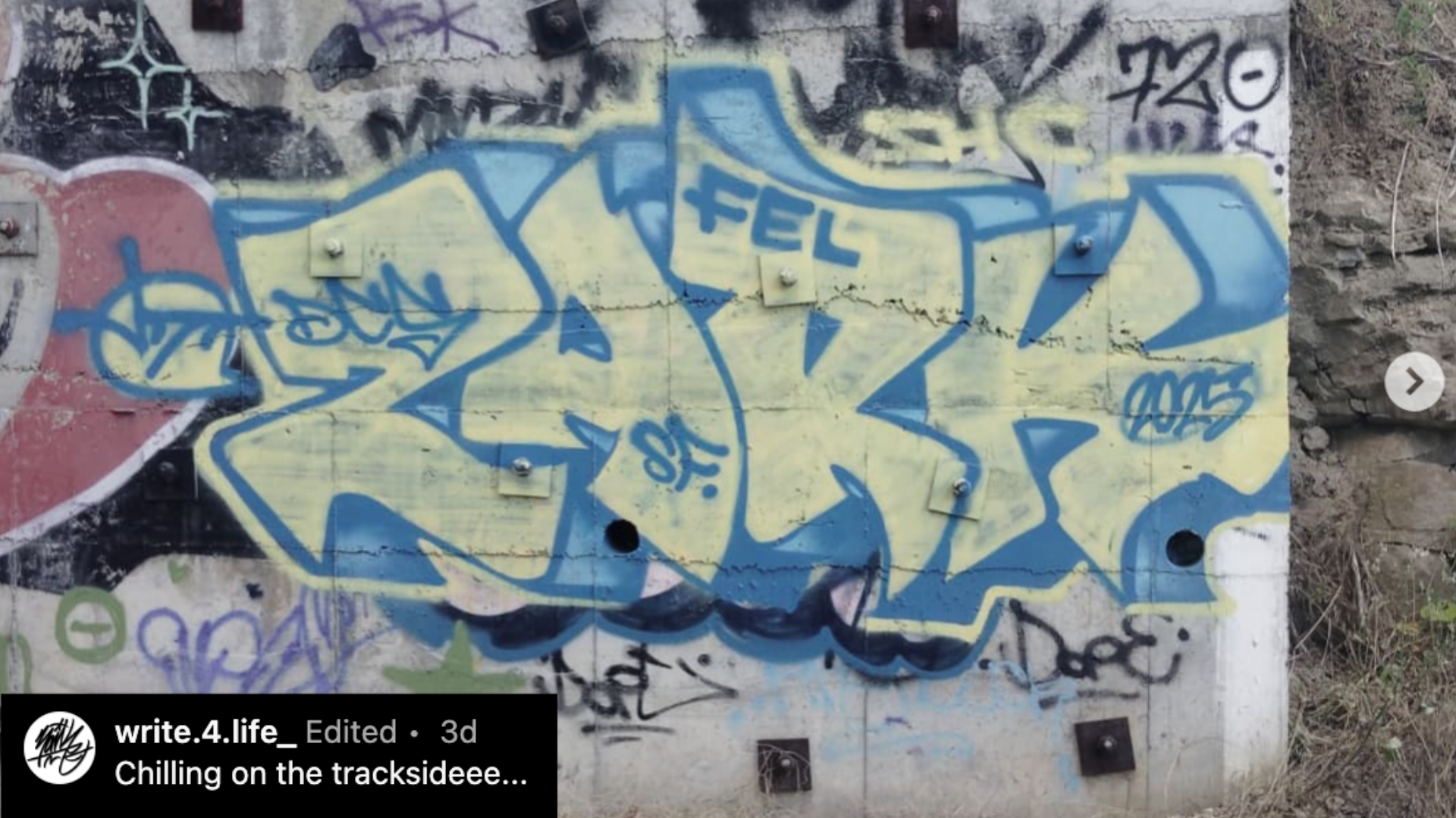
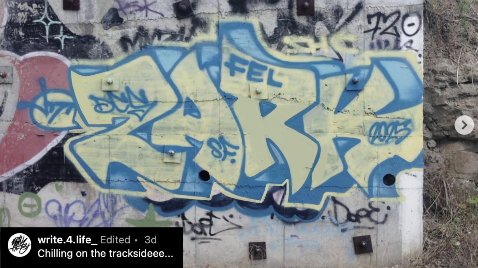
Next up, we looked at a bold piece by Zark, who’s clearly developing a more angular and aggressive style but there's one letter dragging the piece down: the “R.”
The “R” Problem
Everything looks sturdy—until you hit the “R.” It leans too far back and breaks the balance of the entire throwie. It almost looks like it’s falling over.
The center of the R is very thick, much thicker than it needs to be, and thicker than similar areas of other letters. The center also connects to the stem pretty low down, but that’s more a matter of the stem being short. To fix this, we extended the stem, which allowed us to develop the leg a little more, including more of the open counter. We also thinned down the center area where the bowl connects back to the stem. With a few simple changes, the R now fits the rest of the piece and holds its own.
Perfect Wildstyle Structure
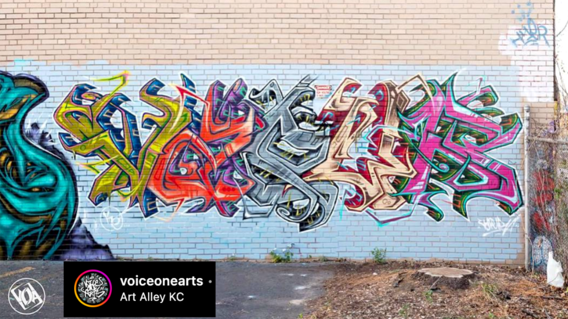


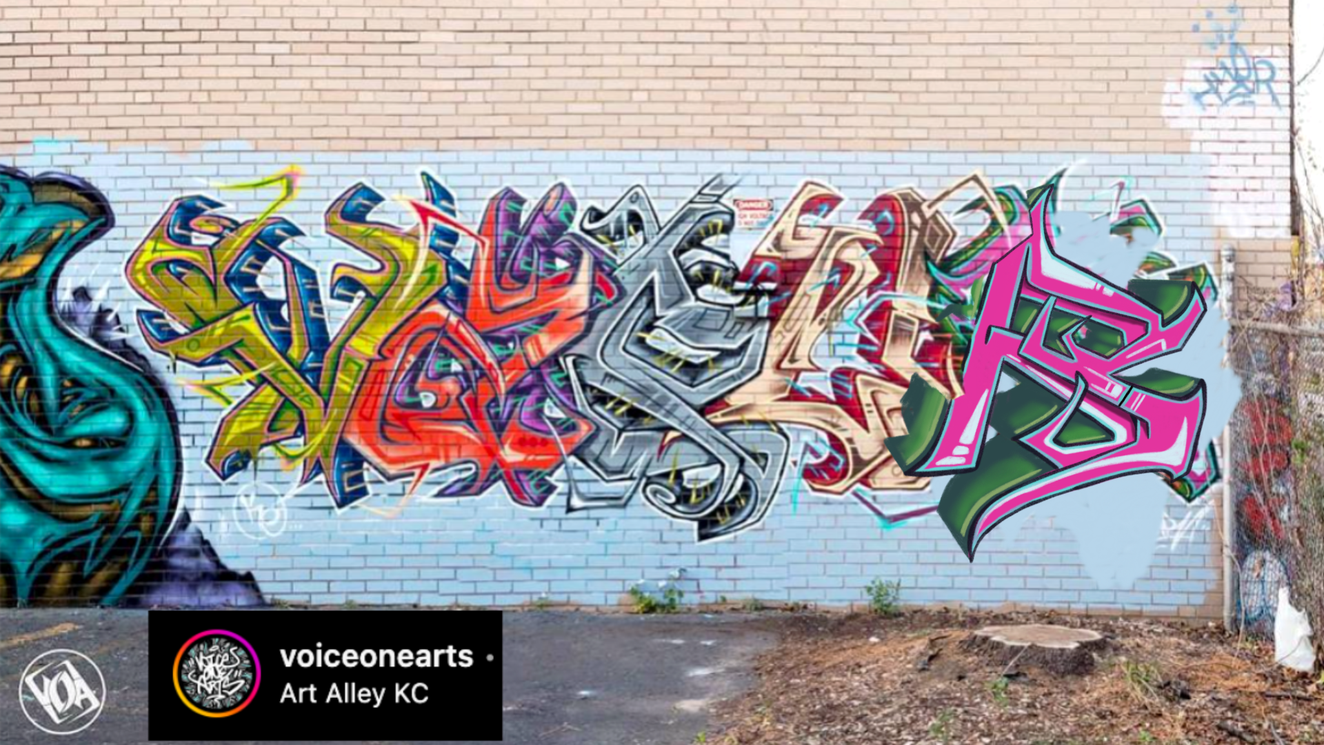
The last graffiti submission came from Vapurs, who’s working in a much more advanced style.
What's Working
There’s a lot to love in this piece:
The overall structure feels complex but readable.
The 3D and extensions are applied with confidence and applied well.
The letter spacing feels balanced and intentional.
Areas for Improvement
Weak leg of the R
I want to start by saying the R is fine as it is, but it is weak in comparison to the other letters, so here’s one of many solutions to help fix that. To help add strength all we really have to do is give the second half of the leg more of its structure. How you design that is up to you, but at the moment, in Vapur’s piece, his R has most of its leg located in the first half of the 2-box leg. This is what creates the lack of structure in that area, and it’s the reason it looks weak. That said, the fix is pretty simple; nothing much more than that needs to be done. As you can see in the pictures, we included a version with the R leaning to the right like Vapur had it, one with the R leaning left, and either of those could work. When your fundamentals are as good as Vapurs, you’ll find that you can use many different options and any of them will still work.
If you're unsure where to start or how to avoid common mistakes, check out our graffiti fundamentals book available online; it’s packed with real lessons and photos to guide your development as an artist.
Grab a digital copy here: Ultimate Graffiti Guide Book Part 1: Fundamentals