

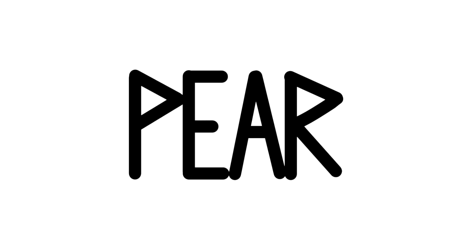
Graffiti Handstyle Fundamentals: Mastering the Basics for Better Tags
Why Fundamentals Matter More Than Style
One of the biggest pitfalls beginners face is diving headfirst into style. Arrows, extensions, and flashy extras might look cool, but without a solid foundation, they create visual noise and reinforce bad habits. Style in graffiti is the exaggeration of correct fundamentals. Without the fundamentals being right, what you call "style" may just be a mistake. This tutorial emphasizes clarity, consistency, and structure to help you grow as an artist.
Start with Basic Structures and the Lettering Chart
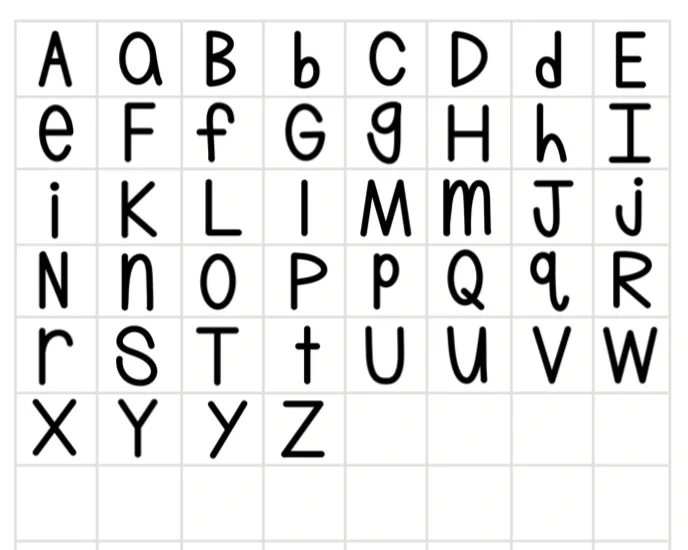
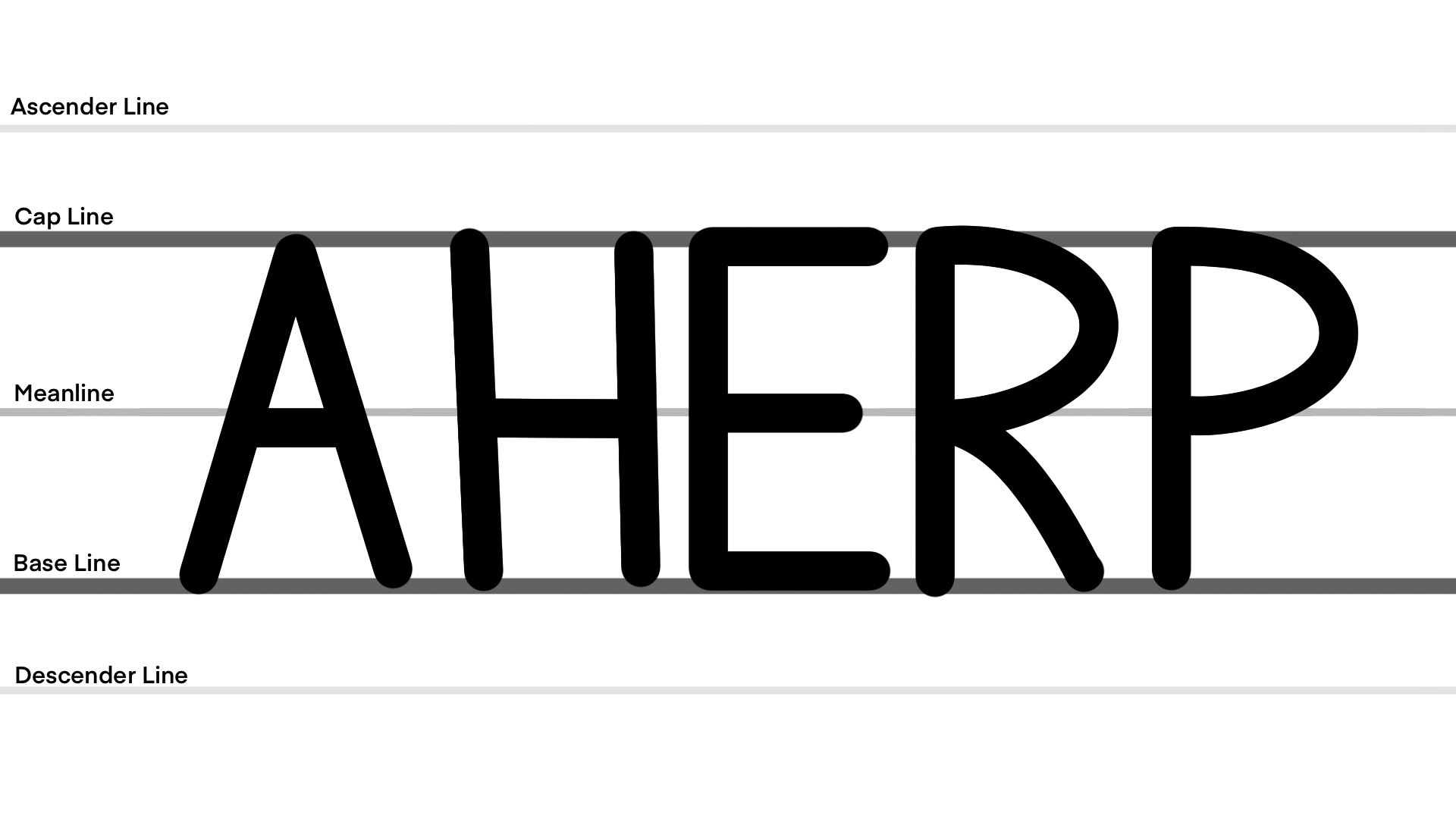
We introduce the concept of basic structures, also known as the “skeleton hand”. These are the simplified forms of letters that you probably learned in elementary school, but here they’re applied with graffiti-specific rules. Using a lettering chart (baseline, mean line, and cap line), you learn how to anchor your letters properly for consistent proportions and weight. The tutorial walks you through why lowercase letters are treated as uppercase letters, and how to build uniform letter widths across your name.
Mastering Letter Name Weight and Positioning


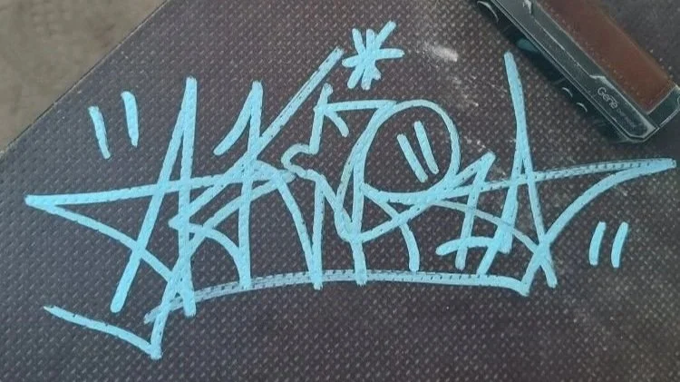
Letter name weight refers to how much attention a letter demands, and it also refers to the space each letter occupies. Consistency is key. Some letters, like lowercase "i," naturally lack visual weight, while other letters, such as M, are naturally heavy. As you’ll see above, the lowecase G on the left has a few different interesting interactions with the basics. On one hand, it also looks pretty short, decreasing its weight, but it also is the only letter that reaches past the base line. This means it gains weight due to contrast. So on one hand, it lacks weight in its structure but on the other hand, it gains weight through attention. On the second iteration we fixed this issue by raising the G and enlarging it so that it’s more in line with the other letters.
Letter name positioning plays a big role in letter name weight, as the positioning of our letters can affect how much attention they receive. We’re lumping it in with weight, because as new graffiti artists you really should have zero issues with this if you’re practicing using the lettering chart. By keeping all your letters on the same line, upright, and well-spaced, is a great way for new graffiti artist to start off practicing, as this allows you to get used to the other basics without having to worry about juggling too many concepts at once. As you’ll notice on the fish tag, our letter H slopes down, and each letter is spaced kind of far from one another. This tag looks more disjointed and doesn’t work as seamlessly as the grim tag before it that uses standard positioning.
What Flow Really Means in Graffiti
Many artists complain that their tags "lack flow," but flow isn't a standalone problem. Flow is a byproduct of all your other fundamentals coming together and the result of that is what determines flow. So if you feel your flow is messed up, then it isnt really the flow, it’s an error with another fundamental. All that being said, what is flow? Flow comes in a three forms, but for now we’re only focused on two, those being line uniformity/similarity, and letter uniformity/similarity. Essentially, the more similar two lines are, the more they’ll flow, and if they’re uniform, then they’ll also flow. The same is true of letters, but this time, instead of focusing on a line, we’re more focused on the whole motif of the letter, like a bowl, for example.
The Importance of Negative Space Management
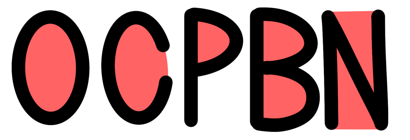
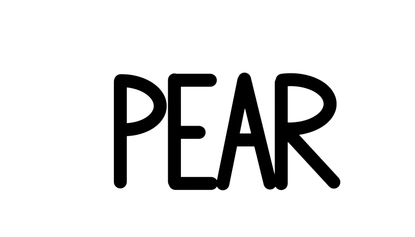
Kerning and counter space are crucial in graffiti. We show you how negative space both within and between letters contributes to the overall readability and aesthetic of your tags. Using examples of closed counters (like in the letters O and P) and open counters (like C and N), the tutorial explains how to control this space intentionally instead of letting it happen by accident.
Tool Awareness: Nib Width and Tag Size


Negative space management in graffiti is just like it sounds: it’s how we control the empty area created by our letters. As writers and artists, it’s our job to take that negative space and use it to our benefit. As for graffiti and it’s basics, we usually restrict space between letters slightly by using a slight overlap. This enhances flow while still allowing the letters to exist with proper structure. If we cut off too much space, then we destroy the structure, and if we have too much space, then we make the name feel disjointed with weak letters.
Introducing Variant Structures and Base Structures
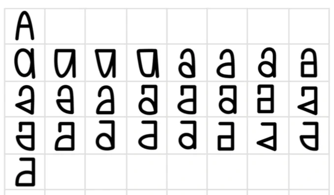
Once you've mastered the basic structures, it's time to explore variant structures, alternate ways of drawing the same letter. These give your graffiti versatility and allow you to find different solutions to problems that your basic structure might be less suited to fix. Some variants have tons of weight compared to their basic counterpart, while some have less. Some letters also have plenty of variants, while others have none such as V, X, H, and O. Combined with your basic structures, these make up your base structures: the letterforms you start with before adding style. If you want a full lesson on variants then check out this blog post here.
What to Look Out For When Practicing
The key to progress is mindful practice. Don’t just replicate letters mindlessly. Study their proportions, spacing, and structure. Use your lettering chart until you’ve internalized it, then test your memory to see if you can maintain those same proportions without it.
If you're unsure where to start or how to avoid common mistakes, check out our graffiti fundamentals book available online; it’s packed with real lessons and photos to guide your development as an artist.
Grab a digital copy here: Ultimate Graffiti Guide Book Part 1: Fundamentals