

Top 10 Graffiti Tags You Need To See!
Bombingscience put together a list of their top 40 tags in graffiti, and I stumbled onto this list and thought it would be fun to share some of my favorites on that list. Check out their list here.
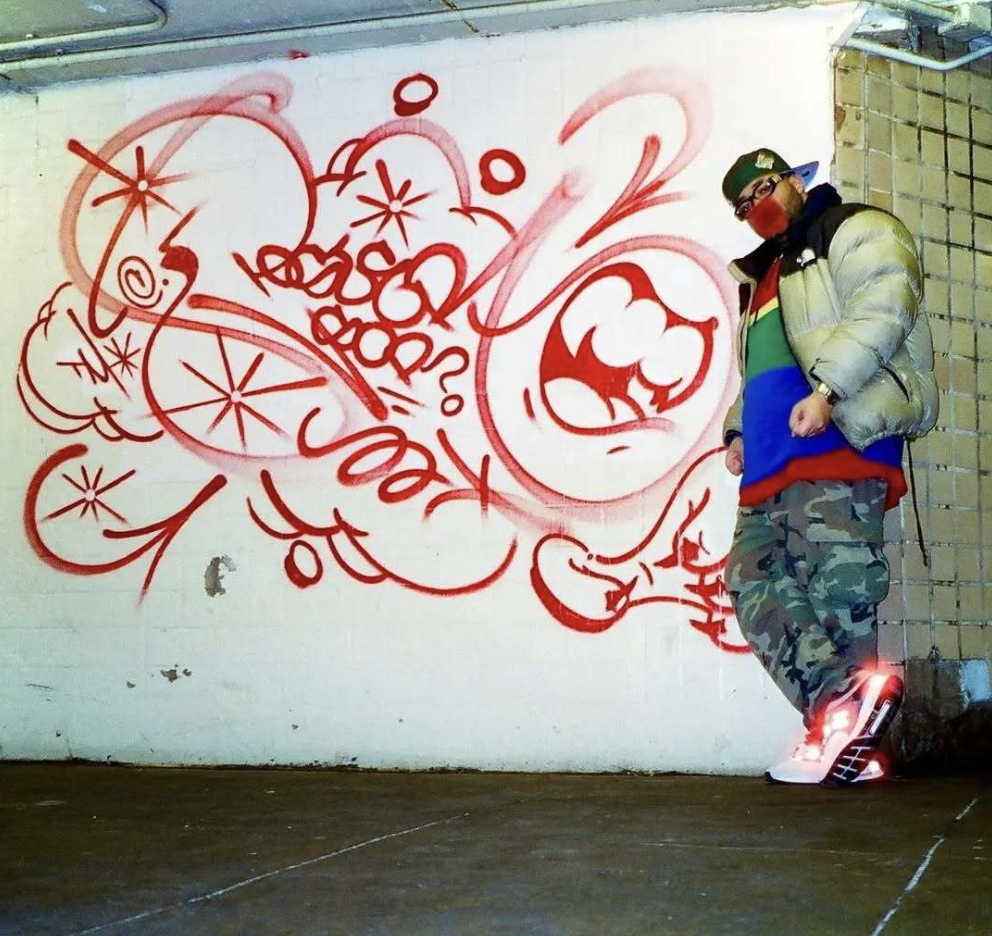
Renos
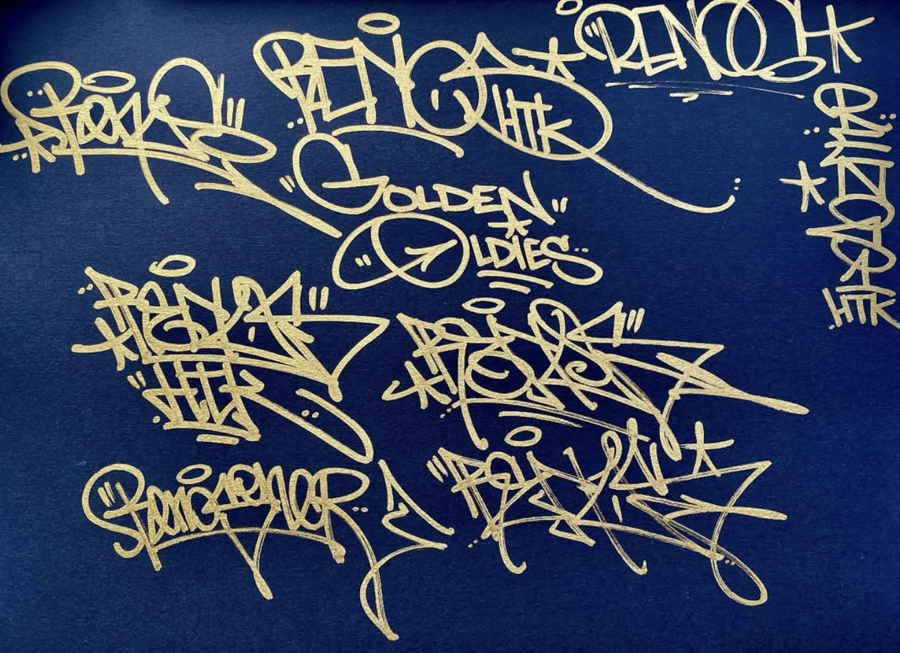
Renos has many refined styles that are all amazing, and are clear branches of one another. What’s better is that his tags have a wide range of technicality, ranging from very simple yet stylish tags to more advanced, heavily stylized tags. Each tag features textbook fundamentals with clear letters that are easy to read and thats not to say that letters or style is only good if it can be read, but rather it’s a declaration of his controlled style.
Sicoer

Sicoer is one we’ve featured on our own list of top notch tags, and it’s no surprise he makes it onto other peoples list as well. Sicoer has incredible control, fundamentals, style, and also awareness! If you’re not paying attention to the smaller nuances of your tags then you might have a solid foundation but simple oversights such as overlapping letters and their flairs can end up ruining a good tag. Sicoer pays attention to how much letters overlap and he expertly increases the flair to lower the opacity of the paint, allowing lines to overlap without interfering with the letters.
Skuf
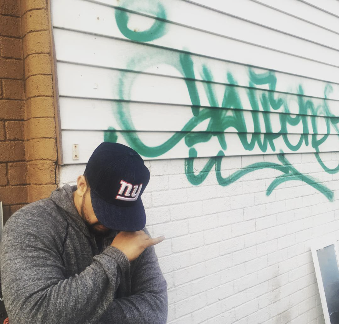
Skuf is a household name in graffiti, but that’s not why he’s on this list. He’s on this list because of what made him famous to begin with and that’s a fresh, clean tag (and throwies). The guy gets up more than most ever dream of and he does it with quality as his calling card. Skuf has one of the more iconic, recognizable tags, and his tag shows how adding style to just one, or two letters can have a huge impact on the name.
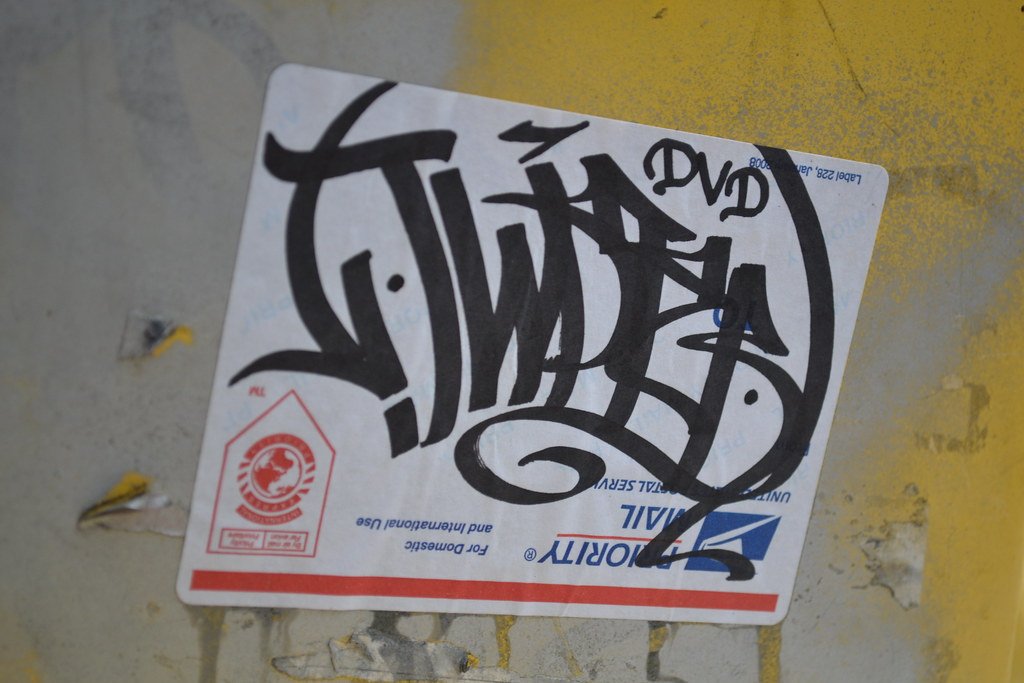
Cetster
What a cool and unique hand style. Now let me be clear, the whole name isnt particularly unique, it’s not as if each letter is something that’s unorthodox, rather it’s how he handled the name, and his C. He did his first C in an unusual way, adding plenty of style and distorting its structure while still keeping it as a C. From there, he balances the C with the extension on the R while also adding flow. This was a smooth and really intuitive way to make a very original C come together seamlessly in the name.
Twist
Twist, similar to Skuf has one of the most clean, simplest tags in all of graffiti. Not to mention, his hand style is one of the most iconic and recognized in all of graffiti. If I had to recommend a writer that new artists study it would be Twist 100%. He demonstrates flawless basics and still manages to cram style into his name, culminating in one of the best tags graffiti has seen in my opinion.
Karma

Philly graffiti tends to look very much the same from one style of tag to another, yet Karma stands out. Karma’s ability to have clean and refined letters is uncommon in most philly tags, as normally, style, and tight positioning are the name of the game. Karma’s hand styles are always approachable and easy to read, even when he turns up the dial on style. When any artist is able to add high amounts of style and still keep the letters refined, that’s a clear indication that they know what they’re doing to a masterful level.
Poster
Poster has a great sense of detail for tags. He’s one of the few writers who can easily add tons of exterior details around the tag and make everything still function well. Normally, when artists try this, their tags become cluttered, unfocused, and their letters pay the price. With Poster, he’s able to bypas that with details that sure catche the eye, but the name still takes center stage. Now, to be clear, he doesn’t do this on all of his tags; that would be unreasonable, but the fact that he’s pulled it off multiple times shows that doing so is no issue for him.
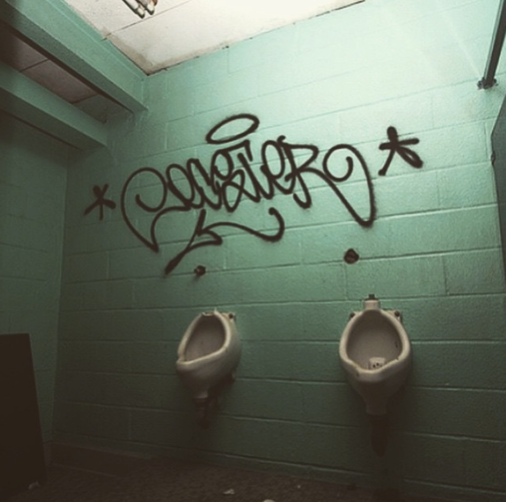
Zeser
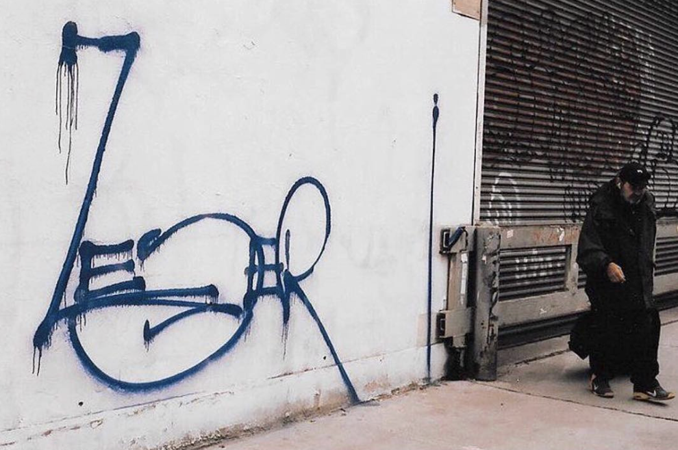
I’ll be honest, Zeser is a weird one, in a good way. See, normally when people add style, it’s primarily added to the structure, and the other fundamentals are stylized around that. Zeser takes a slightly different approach, seldom seen in graffiti. Sure, he messes with structure, but the focus is on the other fundamentals, such as negative space management, letter name weight, and positioning. Take his Z for example, it reaches to the baseline and the ascender space. This creates incredible amounts of weight and space (space above the other letters and weight for the Z. He now has to balance this, and that necessity for weight will affect the design and the position of all of his other letters
Shaken
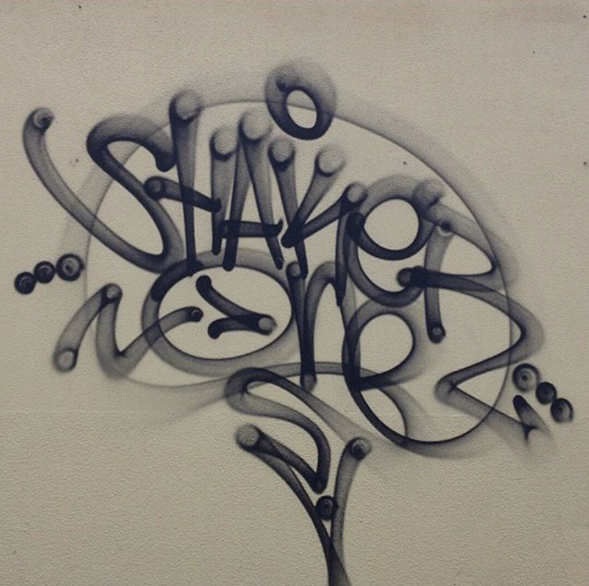
Similar to Sicoer Shaken uses flairs to great effect with perfect use of overlapping lines to help letters really shine. Not to mention his tag is simply just clean and ridiculously refined. Every aspect of Shaken’s tag is crisp. Yoy may notice a pattern here, but once again Shaken is another writer that demonstrates that less is more; you dont need a bunch of wild stuff added to each letter to have an effective tag.
Sofles
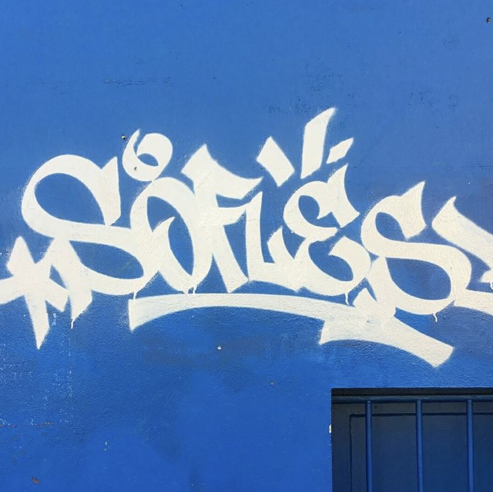
Sofles might just be one of the most famous and well-known writers in today’s generation. That fame didn’t come for no reason though, it can be largely credited to his very original style that’s years ahead of his time. Now he’s another writer capable of many styles, and while not all of his tags are groundbreaking hand styles that push the art form forward, he’s done more than his fair share of tags that are unique and original.
If you're unsure where to start or how to avoid common mistakes, check out our graffiti fundamentals book available online; it’s packed with real lessons and photos to guide your development as an artist.
Grab a digital copy here: Ultimate Graffiti Guide Book Part 1: Fundamentals