

No One Does Graffiti Like This: Learn Why Etsom Stands Out
Have you ever looked at graffiti art around town and felt like a lot of it looks the same? Many pieces seem like variations of styles that have been done before. Today, we're shining a light on a graffiti artist who breaks that mold in a big way. Meet Etsom – an Italian graffiti artist with a style so unique and creative that it might just become your new inspiration. In this post, we'll explore what makes Etsom's graffiti one-of-a-kind, how he merges graffiti fundamentals with imaginative concepts, and why mastering the basics of graffiti is the key to unlocking your own unique style.
The Unique Graffiti Style of Etsom
Etsom has gained a reputation for blending classic graffiti lettering with characters in imaginative ways no one else does. His pieces aren't just letters with add-ons, they often transform into characters of some kind while still spelling out his name. Despite the wild creativity, he never loses sight of the fundamental rules of graffiti. Letter structure remains at the core of his work, even when his letters are bent into flamingos or dragons. In an interview, Etsom explained that he likes to focus on "simple letters" and then experiment by mixing those letters with characters "which melt and become something more". In other words, he ensures his letter foundations are strong and legible, then pushes the envelope with artistic flair.
As we often say here, a strong letter structure underpins any good style, no matter how complex or abstract a piece. Etsom's work is a perfect example.
He proves you can take a solid throw-up or simple letters and evolve them into an extraordinary concept without sacrificing the integrity of the letters.
Many artists who attempt 3D graffiti or character-heavy pieces end up distorting their lettering so much that the letters become weak or unrecognizable. Not Etsom. He manages to maintain clarity and form in his letters, and has them serve double-duty as parts of an image. Even among top graffiti writers known for 3D styles (think of legends like Totem or Daim), Etsom's approach stands out for how seamlessly he merges letter and illustration.
Letters Become Animals: Flamingo and Dragon Pieces
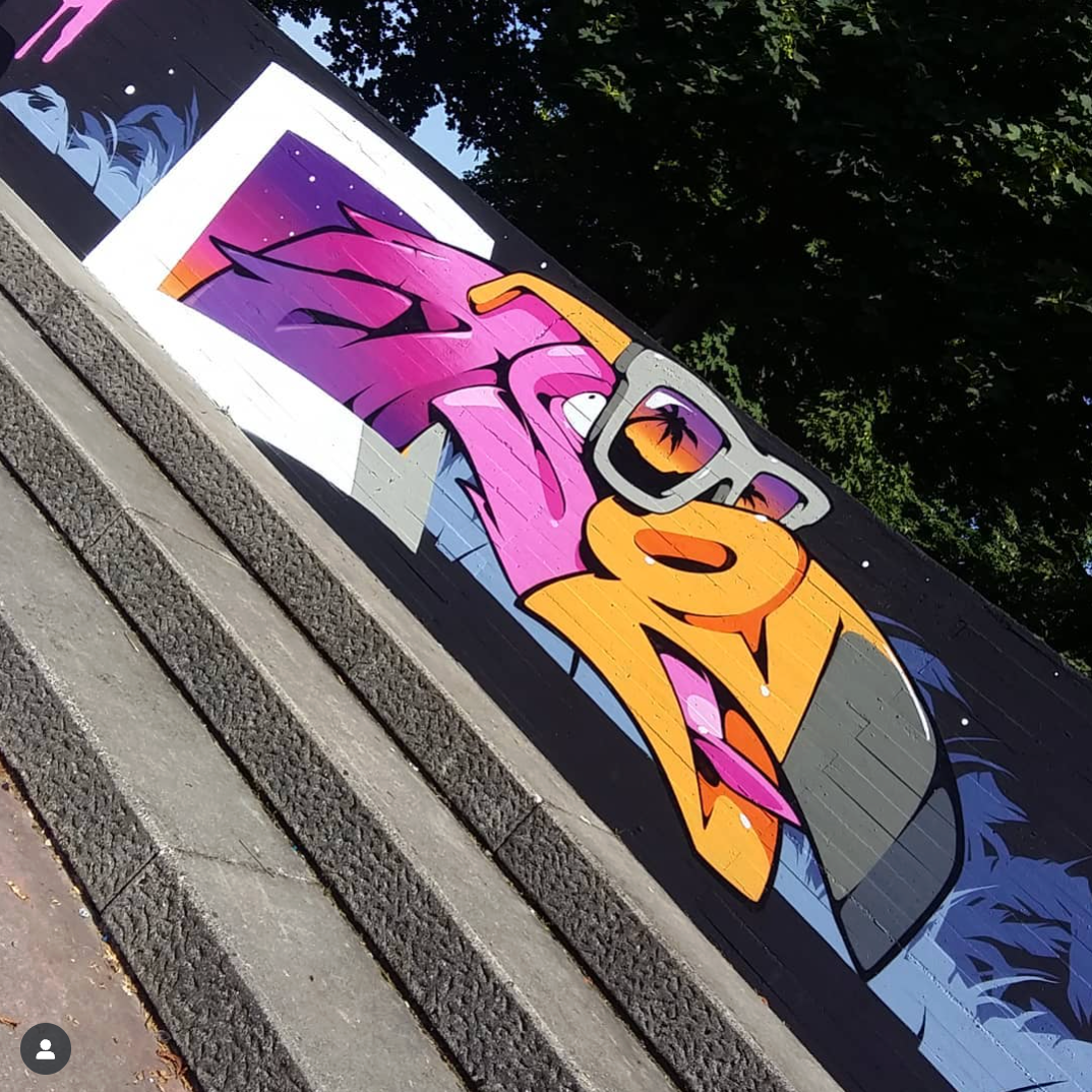

One look at Etsom’s work and you’ll see why no one does graffiti quite like him. Take his flamingo piece for example: it’s a full graffiti piece spelling "ETSOM" that also forms the shape of a flamingo. It’s not just a character painted next to letters; the letters themselves are morphed into the flamingo’s body. The result is insanely cool (and yes, sick in the best way). What’s impressive is how, even with such heavy abstraction, you can still make out the letters. Etsom maintains clean letter structure and readability while creating a fun 3D animal design.
He pulled a similar trick with a dragon-themed graffiti piece. In this mural, each letter of "ETSOM" cleverly builds part of a dragon’s form. The letter S swoops out to create the dragon’s whimsical whiskers, the T forms some sharp teeth inside the open mouth, and the M at the end even turns into big goofy front teeth on the dragon’s face. Even if those teeth look a bit cartoonish and goofy, they’re a brilliant solution to incorporate all the letters of his name into the character and they’re a welcome lighthearted touch. The entire piece still reads as a proper graffiti burner and as a vibrant dragon illustration at the same time. This kind of originality shows that graffiti doesn’t have to be cookie-cutter. You don’t have to copy other writers or stick to a formula for their style you saw online. When you have solid basics, you can let your imagination run wild and create a style that’s truly your own, just as Etsom has done here.
Blending Letters with Characters: Portrait and Unicorn Pieces
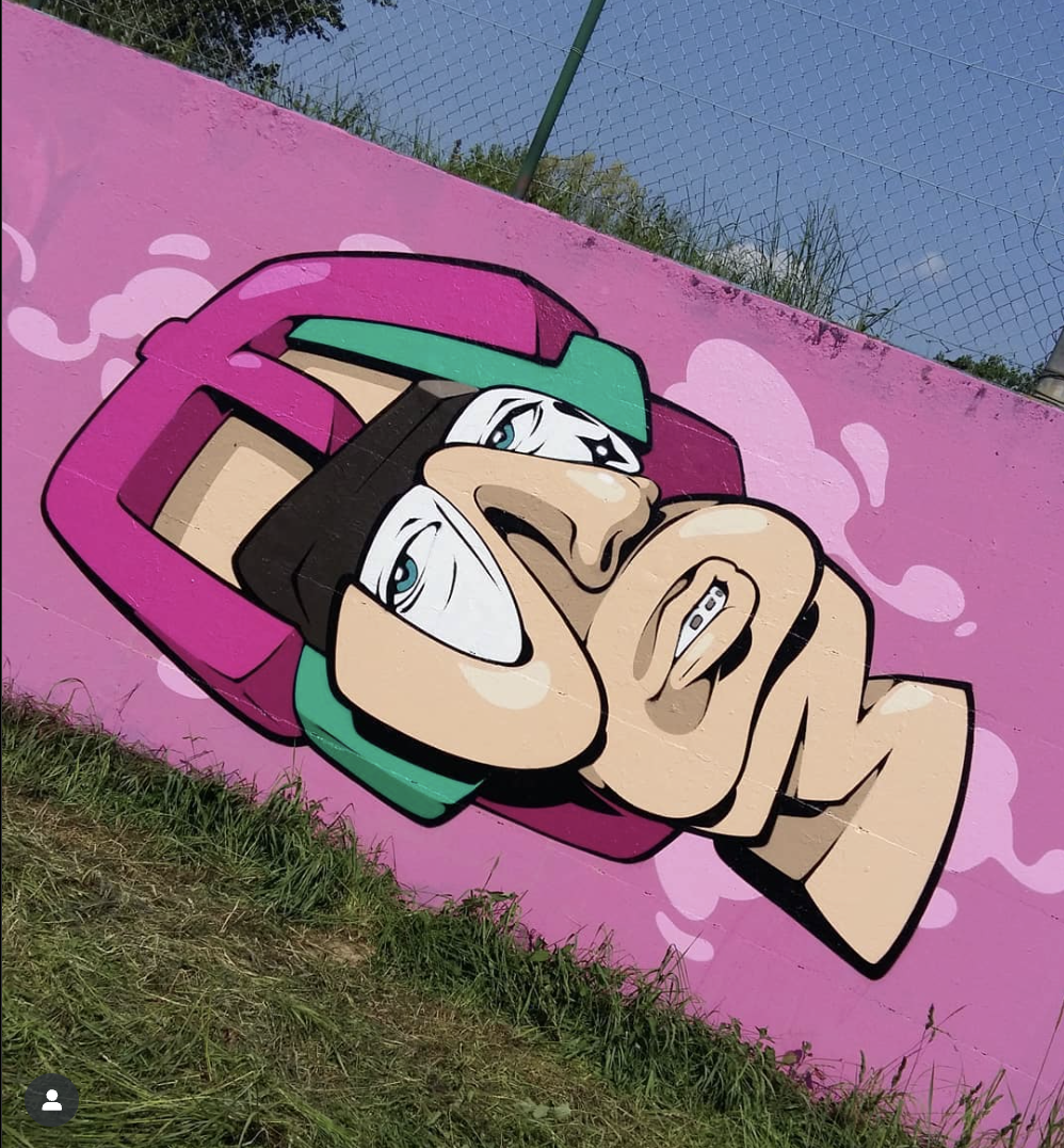

Etsom doesn’t stop at animals. On one wall, he painted what looks like a cartoonish portrait of a person with glasses, and unbelievably, it’s composed of his letters too. Each letter takes on a role in the face: the E becomes a swoop of hair, the vertical stroke of the T doubles as the bridge of a pair of glasses, the S curves into the nose and cheek, the O frames the mouth area (its round shape outlining the lips and mouth muscles), and the M anchors the chin and jawline. The way the O is used here is especially clever, its top and bottom arcs sculpt the suggestion of the orbicularis oris muscles and perfectly. Whether Etsom planned it down to the anatomical detail or it was a happy accident, the outcome demonstrates an expert understanding of both graffiti letters and human anatomy. In the end, the piece reads as a face at first glance, yet a closer look reveals the letters in disguise.
It’s an awesome fusion of portrait art and graffiti lettering that few artists would even dare to attempt.
In another mural, Etsom tackled a mythical creature, a unicorn. And he painted it in possibly the most perfect setting: right under a rainbow. (Talk about lucky timing for a photo!) In this piece, just like with the dragon, his letters form the features of the creature. The O from his name is repurposed as the unicorn’s nostrils. The S is flipped backward and used to contour the unicorn’s brow, cheek, and jaw, giving shape to the face. Meanwhile, the other letters fill out the form (with the E, T, and M contributing to the head and mane structure). If you didn’t know it spelled "ETSOM", you might just see a stylized unicorn portrait at first. It’s only when you step back that the letters reveal themselves. The way Etsom balances two art forms, graffiti lettering and illustration, in one image shows incredible versatility and creativity.
Versatility in Style: From Straight Letters to Hyperrealism
As mind-blowing as Etsom’s letter-morphing pieces are, he also proves his chops with more traditional graffiti styles. If wild characters aren’t your thing, don’t worry, Etsom can rock straight letters and classic styles too. In fact, when I first saw some of his simpler pieces, I was immediately sold on this guy’s skills. He paints beautiful, straight letter pieces (those clean, simpler graffiti letters) with bold style and flawless technique. He clearly has a strong grasp of lettering fundamentals like balance, flow, and spacing. One of his pieces features a gorgeous background where he painted a realistic snake winding through a glass bottle behind his letters. The way he rendered that bottle with reflective light and transparent effects was downright expert. It looked like something out of a high-end mural, not just a graffiti background. This level of detail shows Etsom’s mastery of general art principles beyond graffiti. Remember the seven elements of art you learn in any art class? These include:
Line
Shape
Form
Value
Space
Color
Texture
Etsom has a handle on all of them, and it shows. Those fundamentals shine through in his work. His backgrounds have depth and atmosphere, his letters have strong form and clean lines, and his color choices make everything pop. It’s proof that studying classic art skills will make your graffiti exponentially better.
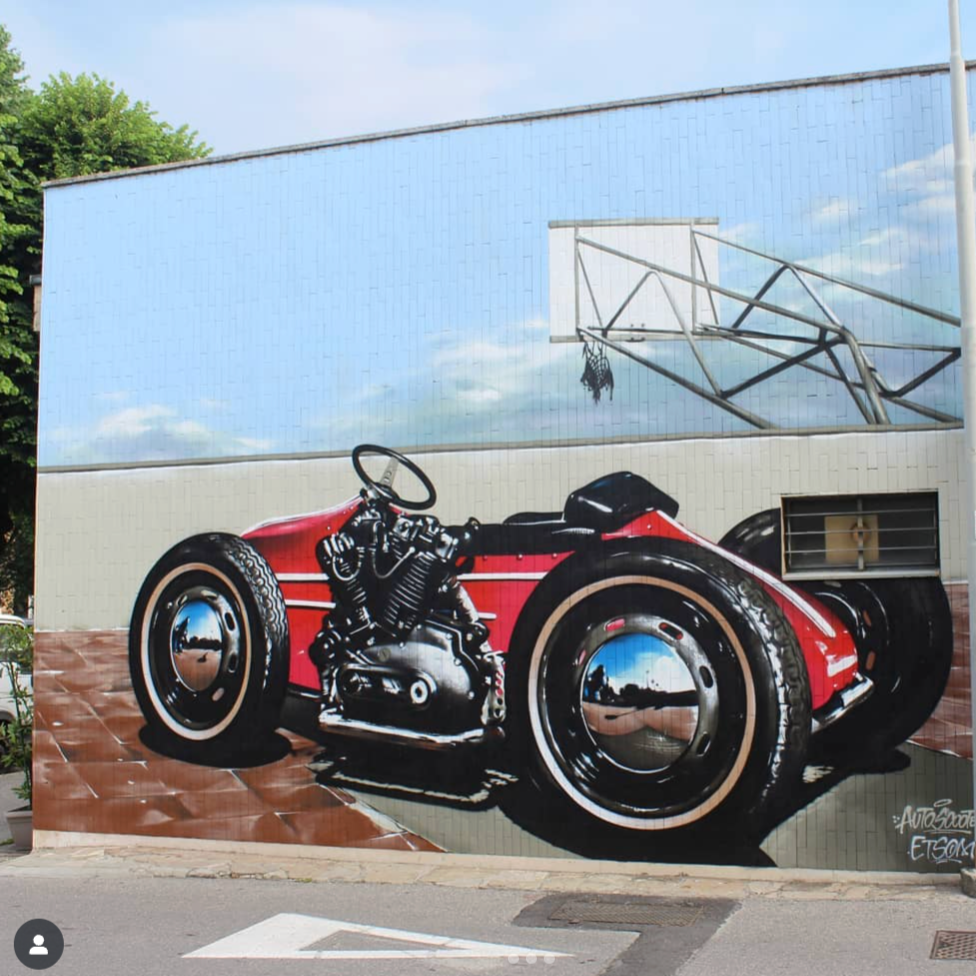
If that wasn’t enough, Etsom also delves into hyperrealism. In one mural, he painted a race car (or maybe the coolest go-kart ever) so realistically that it could stop you in your tracks. While I know nothing about cars, I’m personally a huge fan of hyperrealistic painting, so seeing a graffiti artist incorporate that style was exciting. The car was rendered with such polish, reflections, shadows, and all, it looked like it was about to drive off the wall. It goes to show that Etsom isn’t limited to stylized letters; he’s a well-rounded artist. From traditional graffiti lettering to photorealistic murals, his range further highlights how having a strong foundation in art and technique lets you explore any style you want.
Rethinking the Throw-Up: Etsom’s Next-Level “Throwie”
Perhaps the most unexpected example of Etsom’s originality is how he approaches the humble throw-up (or "throwie"). Throw-ups are usually those quick, bubbly letters artists use for fast tags – meant to be done in minutes and more about speed than detail. They’re typically very simple in style. But Etsom decided to push the boundaries of what a throw-up can be. He created a throwie in a more technical and detailed way; it’s practically a full-fledged piece in its own right. In this throw-up, he treated the letters with the same complexity you’d see in a more elaborate wall piece. He played around with letter proportions and positioning, making some letters larger or overlapping in creative ways. He added extensions and twists that you’d normally only see in pieces, and wildstyle pieces. Even the fill-in had fancy touches, not just a basic one-color fill. Essentially, he infused style and originality into a format that’s usually formulaic.
The result is a throw-up that’s a real head-turner, a breath of fresh air in the world of graffiti. Now, let’s be clear: a super intricate throwie like this isn’t meant for a quick bombing mission. This level of detail isn’t practical when you’re trying to hit a street spot and run. And Etsom, being an experienced writer, surely knows that. The point of this piece wasn’t to create a new standard for street tagging; it was to show that even the most basic graffiti format can be re-imagined as a canvas for creativity. It reinforces a big lesson for every graffiti artist: if you learn the basics, you can remix them and experiment to create something truly unique. Etsom’s tricked-out throwie is basically him flexing his foundation skills and saying, “Look what I can do with them.”
Fundamentals First: Why Basics Unlock Creative Freedom
All of Etsom’s work, as wildly different as it is, comes back to one thing: strong fundamentals. He can twist and warp letters into animals or faces because he thoroughly understands graffiti basics. It's like the old saying, you have to know the rules before you can break them creatively. In graffiti, the number-one rule (the top of the hierarchy of fundamentals) is letter structure. No matter how crazy your concept is, if the letters don't hold up, the graffiti piece falls apart. That's why Etsom always keeps his letters structurally sound, even when they're part of a flamingo or a unicorn. In his dragon piece, for instance, he knowingly sacrificed some letter sizing and weight (his M and O are much smaller than usual) to serve the overall dragon design, but he didn't eliminate them or make them unrecognizable. He balanced the letter structure with the character design so well that neither aspect is lost. This kind of skill only comes from a deep understanding of letter forms and the elements of art.
Build Your Foundation
If you’re feeling inspired by Etsom and wondering how you can develop your own signature graffiti style, the answer is clear: start with the fundamentals. Mastering the basics of graffiti will give you the tools you need to create whatever you can imagine. And we’re here to help you do exactly that. Check out our Ultimate Graffiti Guide Book, a comprehensive resource that teaches all the graffiti fundamentals in depth. We’ve helped thousands of aspiring writers get out of the "toy" phase by breaking down letter structure, flow, negative space, and more in easy-to-follow lessons. The book is packed with detailed tutorials and hundreds of pictures to guide you every step of the way, making it perfect for beginners. (Even seasoned writers have told us they learned a thing or two!) The guide is available as a digital download on our site, and as a physical copy on Amazon for those who prefer a book in hand. As of now, we’re running a special Halloween promo, use the code HALLOWEEN at checkout to get a nice discount on the digital copy at our website. Whether you grab a copy or not, remember that learning the basics is the way to find and evolve your style. No shortcuts or secret tricks will replace solid practice.