

How To Do Graffiti Pieces Breakdown
I was recently asked to do a piece for someone and I thought this would be a great time to break down some of the process as I make the piece. If video content is more so your thing, you can watch the video above, or you can watch it on Youtube here. "How To Do Graffiti Pieces (Full Breakdown)”.
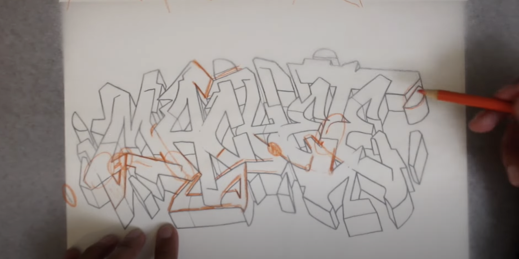
When I start a piece I always count the number of letters in the name as this will help me plan the composition. On top of that I also write the name out to see how the letter relationships are working within the name. This will give me a basic idea of how close or far I should position the letters based on how I like to do graffiti. In this case, we’re working with the name Machete, a seven-letter name. From here, before we’ve drawn any lines I like to think about the direction I’d like my 3D to go, and in this case I initially thought about doing 3D to the right. This means I need more space on the right side of the page, but I ended up putting the 3D down to mitigate a weight issue my piece had. We’re all prone to mistakes and in this piece, I slowly enlarged the last few letters making the right side of the name weigh more than the left. This is also emphasized by the larger natural weight or the letters on the right. Overall none of these mistakes break the piece as a whole, but certainly something to keep in mind when we move to our next piece. With the sketch done, we can now move on to the outline stage.
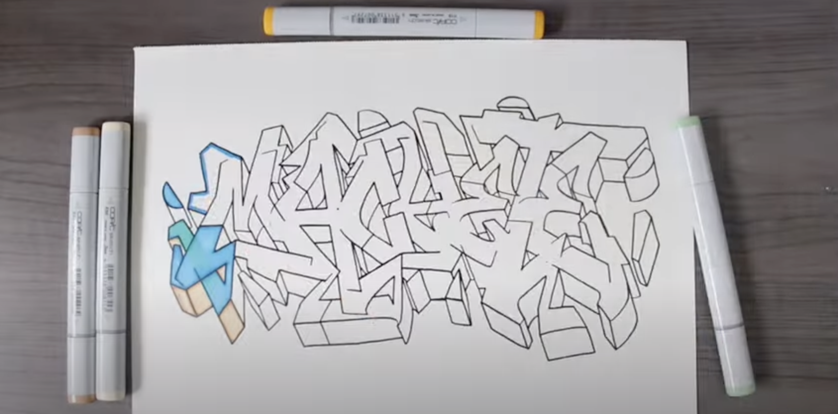
Normally I use a nice brush pen to outline all of my work as the brush offers a greater line variety when drawing. However, recently my brush pen ran out of ink and I haven’t been able to find the same ink so here we decided to outline with a normal outliner pen. These work perfectly well and are fairly straightforward to use and control. You don’t need fancy tools to outline, so use what you have access to, just be sure you let the ink set before you erase the pencil underneath. It always hurts when you put in a lot of time to outline only to smear the ink because you didn’t wait long enough for the ink to set.
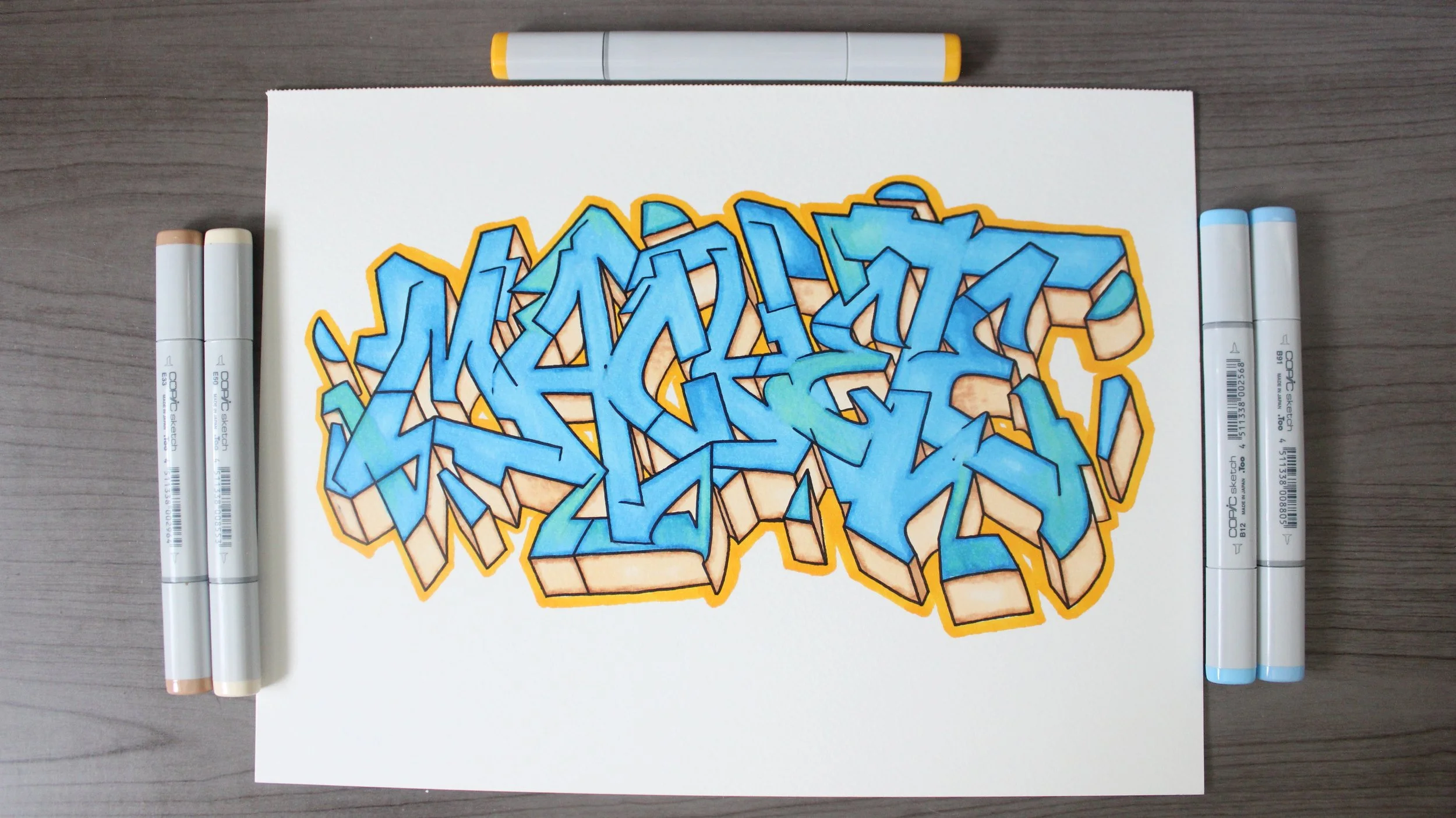
Once your lines are done, you can move to color. If you’re having issues picking colors for your piece then I recommend studying some color theory, this will solve all of your coloring issues. Color theory will teach you about color harmony and it will give you the knowledge and confidence to control your fills. Here I chose a blue fill-in for the letters, with a soft warm peach color. I didn’t want too saturated of a warm color as this would begin to compete with the fill especially since the fill doesn’t have any interior detail. Less saturated colors grab less attention, as do brighter colors so the soft warm goes well with the blue. Simply coloring the fill and 3D one solid color is fine, I wanted a bit more pop in the piece. To achieve this, I took a darker blue, and a darker brown, and I outlined the inside of the letters, then used the lighter fill color to blend the darker color out for a softer gradation. This adds just a hint of pop to the letters. As a bit of an extra, I was curious to see how the new markers would layer, so I grabbed a green and laid it on certain areas sparingly throughout the blue. Overall I like the result, and that completes the commission.
If you’re looking to learn the basics of graffiti then check out our brand new book The Ultimate Graffiti Guide Book Part 1-Fundamentals where you’ll learn all of graffiti’s basics in an easy-to-follow book. By the end of it, you’ll fully understand how to find your style, and how to keep progressing for the rest of your graffiti journey.