

Uter’s Wild Throwie Explained: Graffiti Style Breakdown
Graffiti artist Uter has gained attention for an unorthodox approach to throwies, turning them into an opportunity for creativity and technical mastery. In this throwie breakdown, we’ll explore how Uter pushes the boundaries of traditional graffiti letter structure. Unlike the typical throw-up done in a hurry, Uter’s throwies are carefully designed and still hold solid fundamentals. We’ll dive into the creative graffiti techniques on display, from unusual weight distribution and anchor letters, to integrating characters like rabbits and Charmander into letter forms, to inventive double-layered letters. By examining these stylistic choices, we can see how Uter’s work demonstrates both technical mastery and the limitless creativity possible in graffiti once the basics are mastered.
Unorthodox Throwie Letter Structure
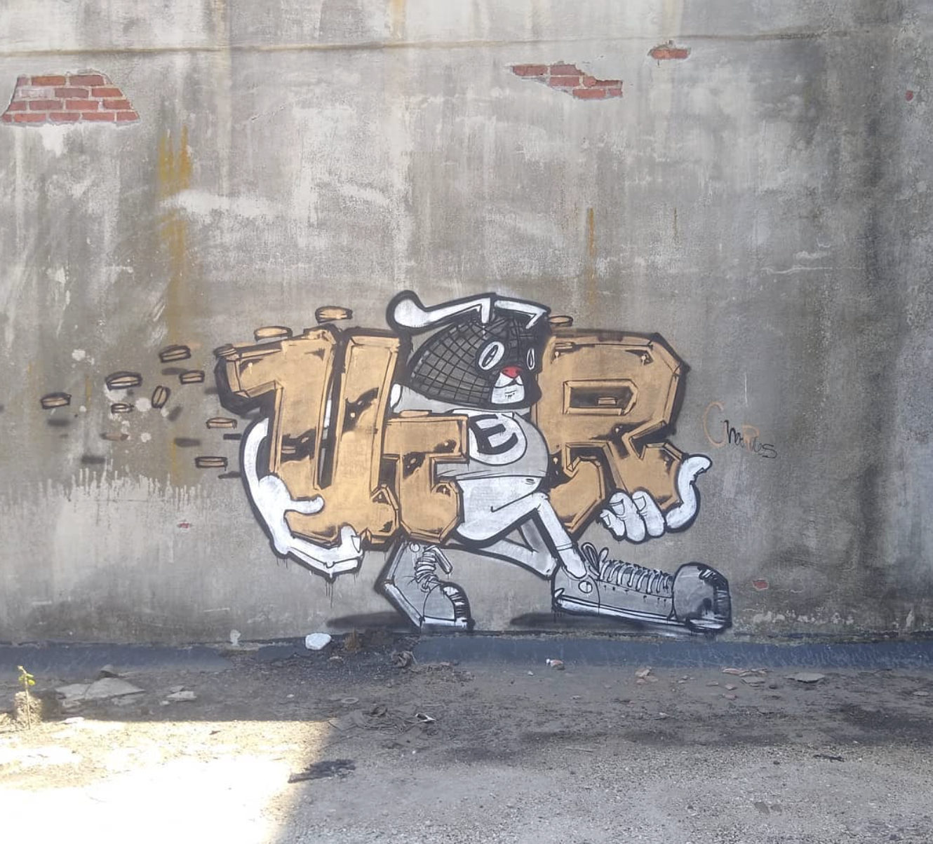
From first glance, Uter’s throwies stand out as unique and unorthodox. The letters in Uter’s throw-ups are far from the generic bubble letters most graffiti artists use for quick spots. They intentionally deviate from the norm, experimenting with proportions and shapes while keeping fundamental principles intact. For example, in one throwie the letter “U” is drawn extremely thin and tall on the left, near its top, immediately followed by a tiny “T”, one of the heaviest letters in the alphabet. This unconventional structure continues with a massively oversized third letter that serves as the centerpiece. By deliberately warping the usual letter sizes and forms, Uter creates a third letter that grounds the weight for the whole name. Suddenly, all the weight of the left (UT), and right (R) is balanced by what’s supposed to be an E. Now the actual throwie shape Uter used does not at all make an E, they ignore structure and more so use a shape or character as a placeholder for the letter instead of actually drawing the intended letter. Uter shows that throwies don’t have to be basic – with thought and design, they can have their own bold identity while respecting graffiti basics.
Weight Distribution and the Anchor Letter
One of Uter’s most impressive technical tricks is his management of weight distribution across the letters. In design terms, “weight” refers to how much visual heft or attention an element commands. Uter plays with this by drastically varying the size and coverage of each letter, then using one anchor letter to hold the composition together. In the example of his name, U T E R, it starts with a very light, slim U and a shrunken T, then makes the third letter enormous to act as a weighty anchor in the center. This big, “bulbous” center letter carries most of the visual weight and stabilizes the whole throwie, preventing it from feeling lopsided. The final letter “R” on the right is drawn larger again, but a large portion of it is cleverly tucked behind the giant center letter, so that the R’s apparent size (and thus weight) is partly obscured. Hiding part of the R mitigates its weight and puts it on par with the lighter U on the opposite end. The result is a beautifully balanced name where the outsized middle letter holds down the center of gravity. Uter’s use of an anchor letter lets him break “rules” with the others, making some tiny and others huge, without the throwie collapsing into chaos. By distributing weight thoughtfully, he achieves a dynamic yet harmonious letter lineup.
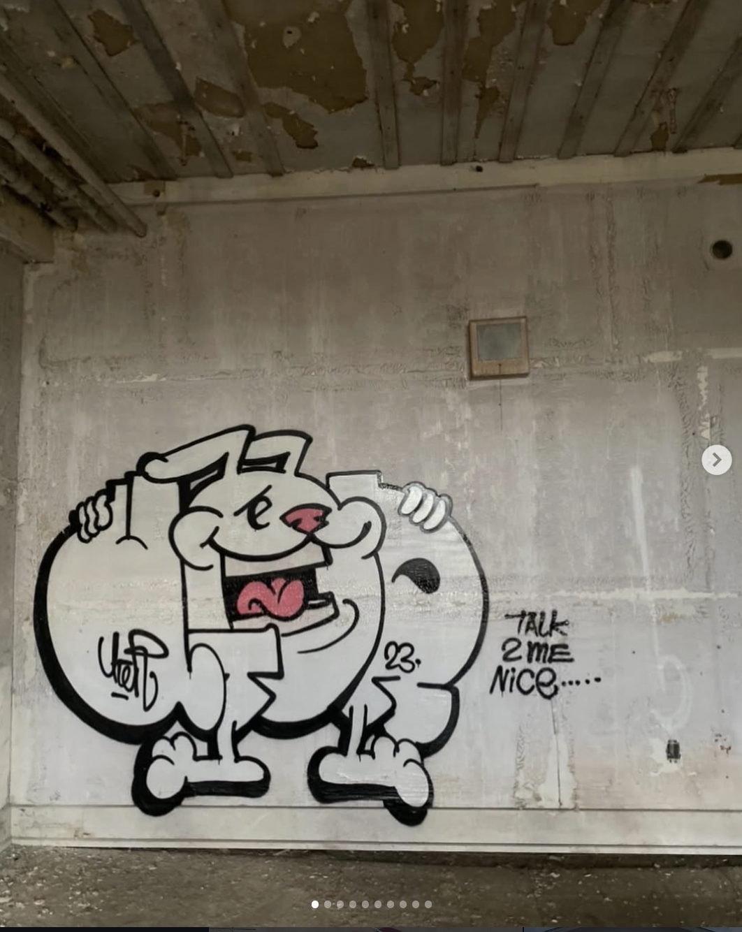
Characters as Letters: A Creative Character-Based Graffiti Twist
Perhaps the most playful aspect of Uter’s style is how he replaces traditional letters with characters or illustrations, a bold character-based graffiti technique that showcases immense creativity. Instead of always drawing the letter itself, Uter will sometimes draw a character or object effectively making the artwork part of the name. For instance, in one throwie variation, the letter “E” in “UTER” is almost entirely substituted by a cartoon rabbit. The rabbit’s form takes the place of the letter’s structure, with only the rabbit’s eyeball drawn as a letter “E” to clue us in that this creature represents the letter E. Apart from that small embedded “E” in the eye, the bunny looks more like an “O” shape, so without the eyeball detail, viewers might mistake the intent and read the letter wrong. This example shows Uter carefully balancing style and legibility: he pushes the art to an extreme (turning a letter into a rabbit) but still includes a hint of the actual letter to maintain clarity.
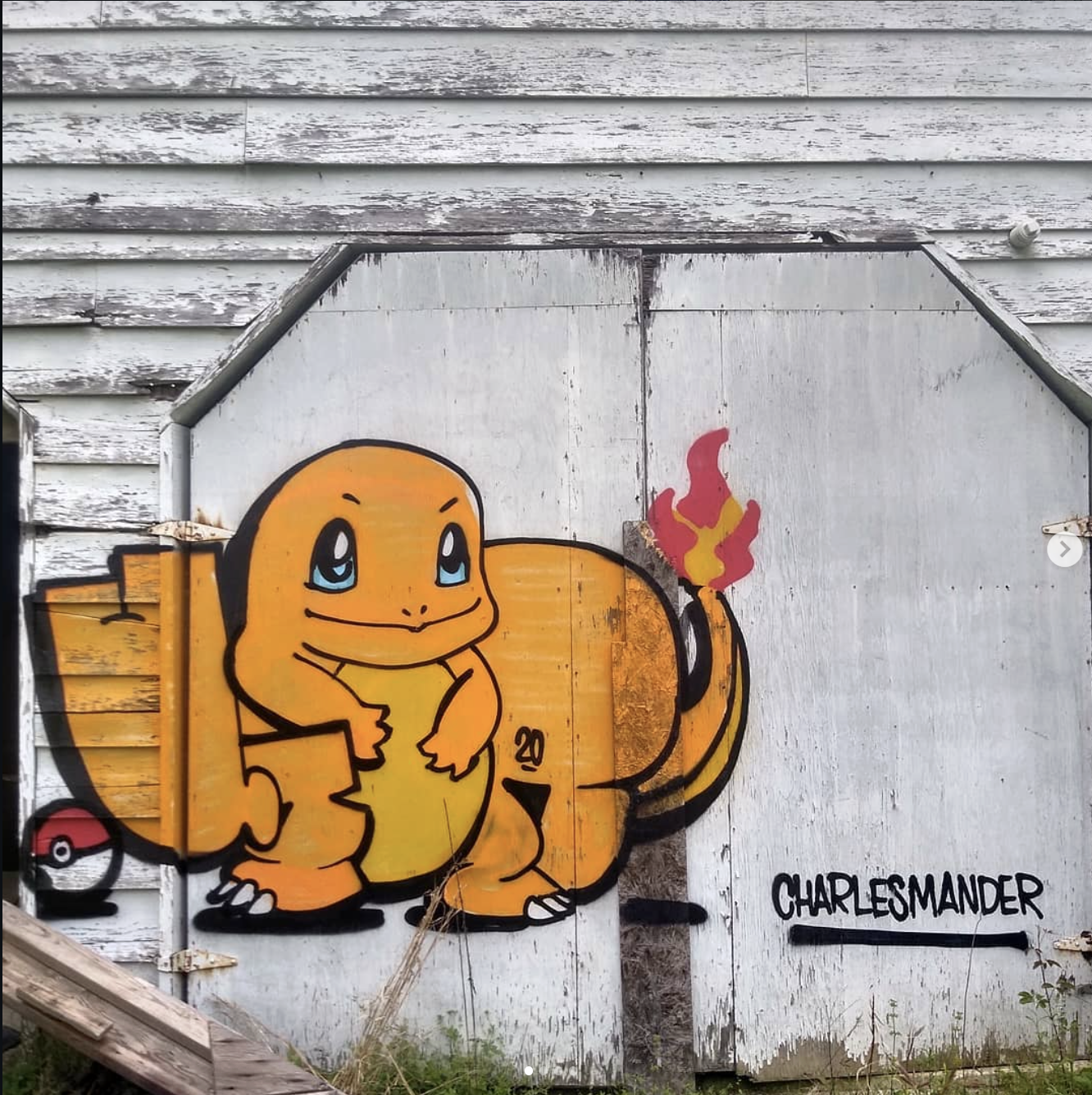
Uter repeats this trick with other characters as well. In another throwie, a rabbit character steals the letter, and in yet another, he uses a Charmander (the popular Pokémon) in place of a letter. In the Charmander throw up, Uter foregoes drawing the letter “E” outright; instead, he makes the character’s features carry the weight. For example, Charmander’s eyes might contain a tiny “E” that implies the letter, while the overall Charmander figure occupies the space and attention that the letter normally would. This means the letter’s presence is suggested rather than explicitly formed. Amazingly, it works, the character draws so much attention (through contrast, size, and detail) that it effectively does all the jobs for each fundamental that the letter would normally do, with the exception of spelling and containing structure. These character-based letter substitutions are not only fun and inventive but also demonstrate a high level of skill. It’s a risky technique (an improperly done character letter could confuse readers), and doing so can even ruin your throwie or piece (assuming you want to try this on a piece). Enthusiastically embracing both discipline and creativity, Uter shows that the humble throwie can evolve into something truly extraordinary when artistry and technique go hand in hand.
Want to learn more about graffiti and its basics, pick up our Ultimate Graffiti Guide Book where you’ll learn each of graffiti’s fundamentals and much mouch more.
Grab a digital copy here: Ultimate Graffiti Guide Book Part 1: Fundamentals