

Graffiti Handstyle Tutorial Fundamentals Explained 2026
How to Do Graffiti Tags: A Beginner’s Graffiti Tag Tutorial
Graffiti tagging is the most basic form of graffiti writing, it’s your personalized signature scrawled with a marker or spray can. Tags are considered the foundation of graffiti culture. This tutorial covers graffiti for beginners, explaining letter structure, negative space, line weight/nib control, and flow. You’ll learn how to build a proper handstyle from scratch, one that’s clean, readable, and built on strong graffiti fundamentals. By mastering the basics first, you’ll set yourself up to develop your own style with real structure behind it.
Understanding Letter Structure in Graffiti
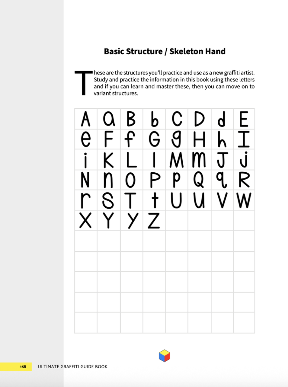
Basic structures are the most stripped-down, print-style versions of letters, clean, no flair, no style.
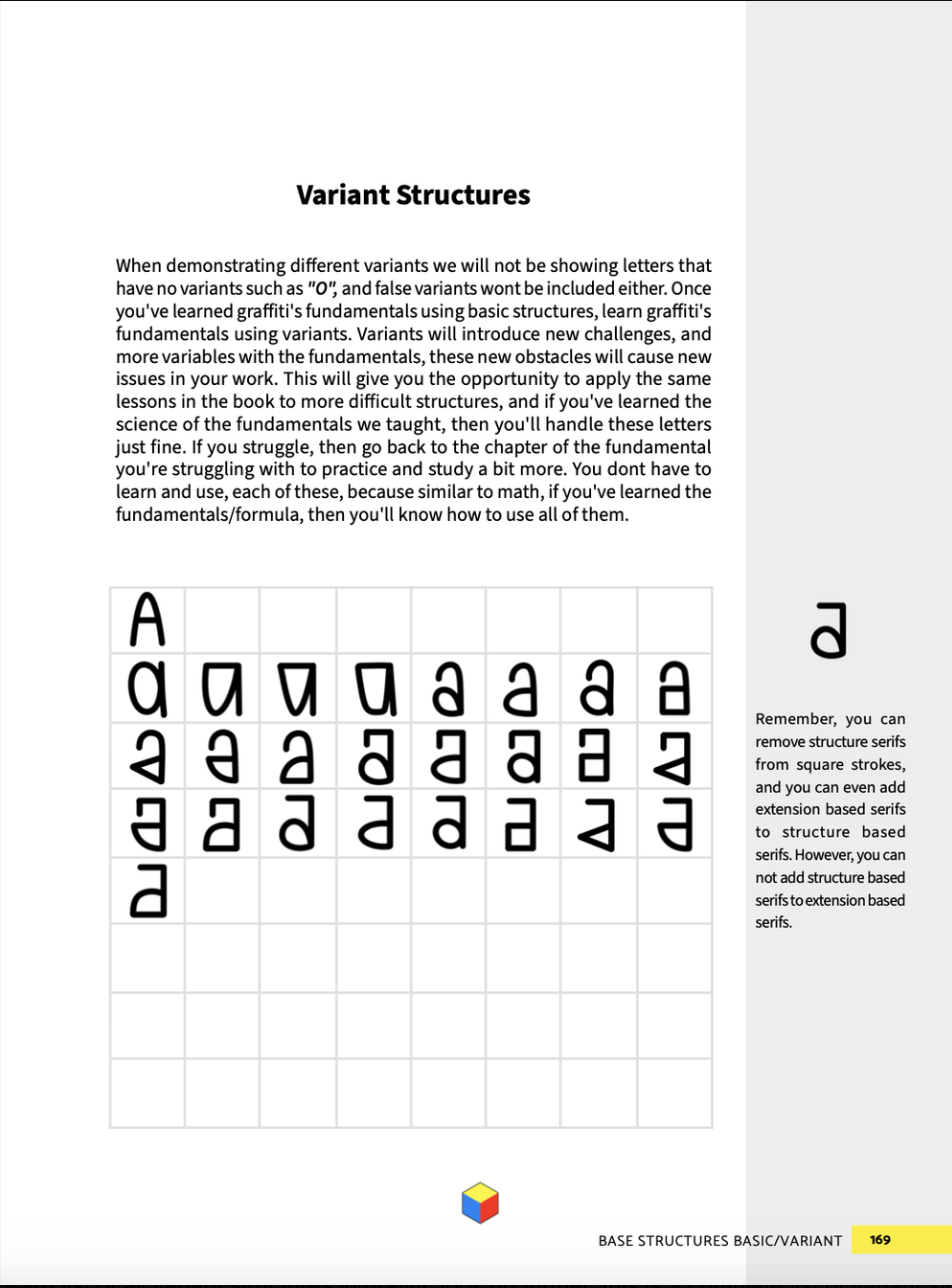
Variant structures are alternative versions of those same letters, using different strokes or shapes to add subtle variety.
If you’re just starting out, always begin with the basic structures. They’re the foundation for everything that comes later.
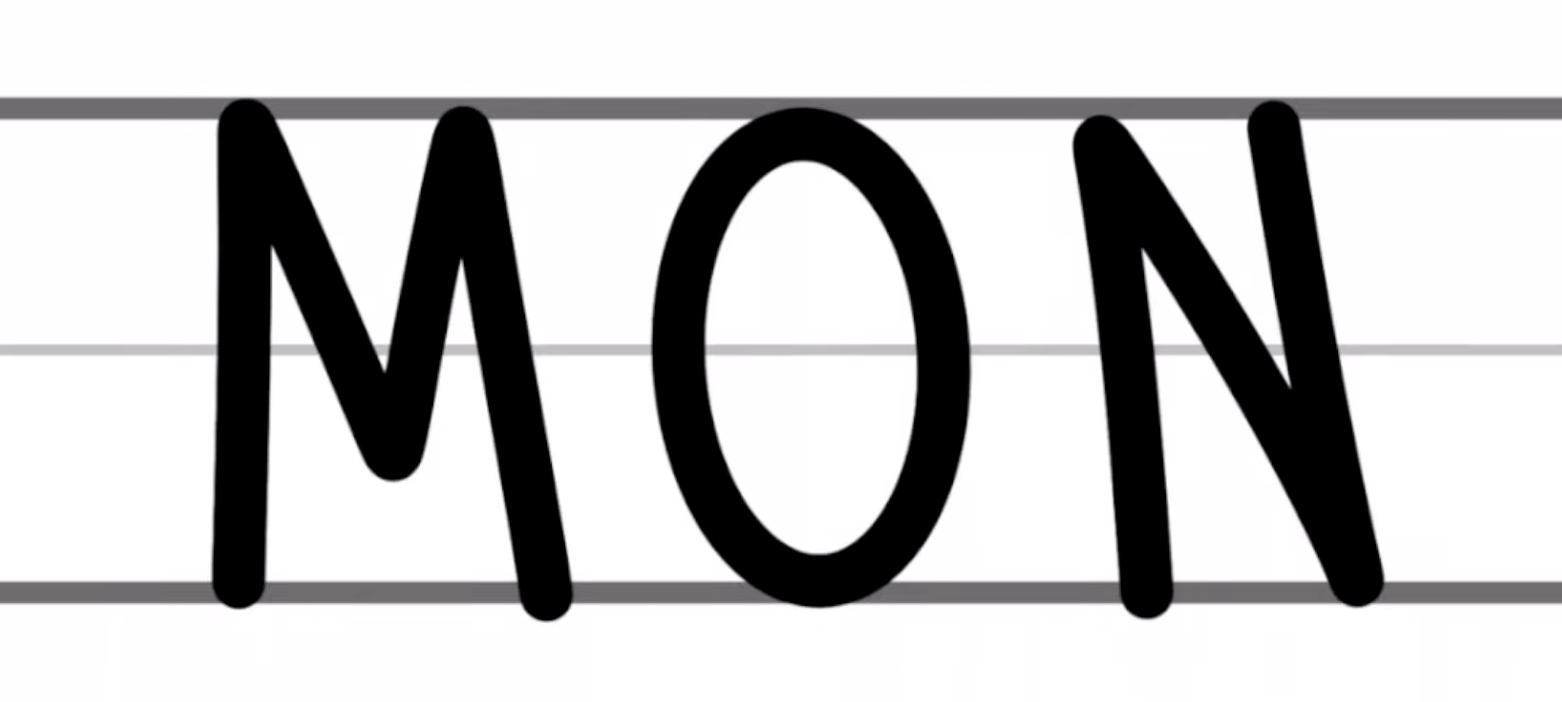
To keep your letters aligned and balanced, use a lettering chart with guide lines:
Baseline: where the bottom of each letter sits.
Mean line: where the middle of most letters sit.
Cap line: the top boundary for your uppercase letters.
These guides help you control height and consistency across each tag. Practicing your ABCs and 123s on these guides helps build proper spacing and form.
Managing Negative Space and Proportion
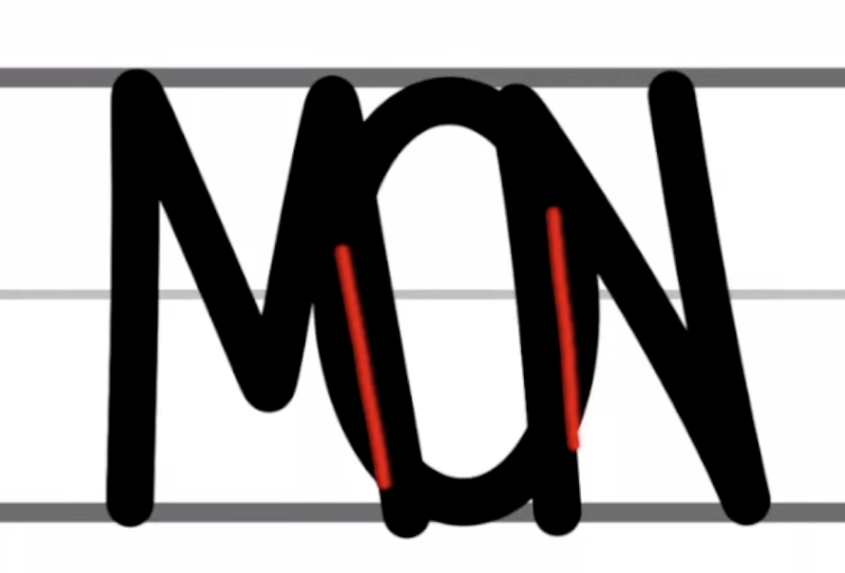
Negative space is the empty area between and inside your letters. Well-managed negative space makes your tags clean, readable, and balanced. Here’s how to get it right:
Keep letters proportionate. Make sure each letter has similar height and thickness. If one letter is too skinny or too wide, it’ll break the balance.
Match your tool to the space. Don’t try to use a giant marker on a tiny surface or a micro nib on a huge surface. If your marker is too fat, your letters will bleed together. If it’s too thin, they’ll look weak or disjointed.
Use controlled overlaps. Slight overlaps between letters can help your tag flow, but if letters overlap too much, they’ll lose definition. Keep overlaps tight and purposeful, not messy.
Using a lettering chart with cap line, mean line, and baseline also helps keep your negative space consistent across different letters.
Achieving Flow in Your Tag
Flow is the coheasion of your letters. A good tag has a natural visual movement, where each letter leads into the next.
A lot of beginners blame their lack of flow on “style” issues when the real problem is poor fundamentals. The truth is, if your basic letters are built right, with clean structure, consistent weight, and proper spacing, flow happens on its own.
To improve your flow:
Connect letters slightly. Overlaps should be gentle and controlled.
Pay attention to angles. Letters that slant slightly in the same direction tend to flow better than ones going in opposite directions.
Use consistent height and width. This makes the whole tag look unified.
Remember: flow doesn’t come from decoration, it comes from alignment, spacing, and confidence in your strokes.
Handstyle Basics and Practice Drills
Here’s a simple drill path to follow if you’re starting from zero:
Practice straight alphabet letters using your baseline, mean line, and cap line.
Write your tag name over and over in basic form, no style.
Use proper spacing between letters to avoid cramping or too much dead space.
Use the right tool for the job. Make sure your nib is the appropriate size for your tag/surface.
Repeat with intent. Don’t just doodle mindlessly. Focus on improving line control, shape, and balance every time.
Once you can do your entire tag cleanly, with consistent weight, spacing, and proportion, then you can start experimenting with style.
Style Comes After Strong Fundamentals

Every beginner wants to jump into style right away. Resist the urge. Style is just an exaggeration of the fundamentals. If your fundamentals are weak, your style will look messy and forced.
Once your basic letter structures are locked in, style starts to emerge naturally. You’ll begin to see where you can stretch a stroke, curve a line, or break the rules, and your handstyle will evolve from there.
If you’d like to improve then check out our digital copy of the Ultimate Graffiti Guide Book Part 1: Fundamentals . Its the best graffiti book on the market by far.