Top Ten Best Graffiti Throwies
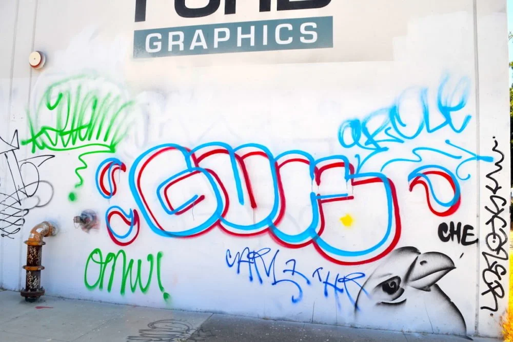
Graffiti throwies have always been an essential element of street art, giving artists a way to quickly tag their name while leaving a lasting impression on urban landscapes. In this post, we’ll dive into the Top 10 Best Graffiti Throwies, as voted by graffiti fans worldwide. This isn’t just a list—it’s a celebration of the raw talent and creativity that each artist brings to their throwie styles. Let’s break down what makes these throwies stand out from the crowd.
10. Post
Post’s throwie is all about simplicity with a splash of creativity. His letter structures are clean and straightforward, but it’s the energy and personality he brings into the finer details that make his throwies unique. Whether it’s a squiggle running through the letters or the positioning of the characters, Post keeps it interesting while maintaining a traditional throwie foundation. Under all the style we end up with some pretty simplistic letters, and this stand out foundation lets him build a unique throwie ontop of that base.
9. Kez
A household name in graffiti, Kez’s throwies are refined for the streets. His style is efficient and sharp, perfect for someone who is constantly getting up. There’s just enough flair to make his work recognizable, but Kez keeps his throwies fast and precise—a mark of someone who’s been tagging for years. Personally, I really enjoy how their work leans slightly closer to a straight letter. I’ve always liked throwies that get close to being a straight letter because its a fine line to walk, and creeping up to that edge isn’t easy so when it’s done well, I cant help but love it.
8. JD
Coming in at number eight, JD’s throwie has a beautiful flow. His J bends dramatically to the left, allowing it’s curve to seamlessly flow into a rounded D. The continuity of his letters gives the throwie a fluidity that’s rare in most throwies. JD’s style stands out for its balance of structure and smoothness.
7. Grabs
Grabs’ throwie strikes a personal chord for me as I once had a G and a R that looked very similar and I’m glad to see another great artist similarly use these letters. Grab has himself an eye-catching throwie with bold letters that have just enough unique flair to stand out as a recognizable throwie. At the end of the day that’s part of what makes a great throwie and grab certainly achieves that. A good throwie balances function (qualities that make it practical to use outside) with good fundamentals. Often times new artists pamper their throwies, focusing all their attention on how stylish it looks rather than how practical it is to use.
6. Moses
Moses doesn’t just use bubble letters; he owns them. His throwies are massive, rounded, and built for speed. By minimizing sharp angles, Moses ensures that his letters are quick to execute while still packing a visual punch. His ability to cover large surfaces in a short amount of time without losing quality makes his throwies unforgettable.
5. Taps
Taps throwie is clean, crisp, and consistent, especially in how he handles tricky letters like “T.” Most artists slant their T’s, to help compensate for the large negative space the letter brings to the table but Taps keeps his straight and bold. While certainly most skilled writers would manage a standing T just fine, his ability to do so proves exactly that, he’s a skilled writer. His style reflects a high level of experience and mastery, making his work stand out in any urban landscape. Not to mention, when it comes to throwies, bigger is almost always better. If you’re the kind of writer who can consistently do your throwie large, larger than the average, then your throwie is going to stand out much more and Taps demonstrates that well.
4. Gun
Gun’s throwie is a departure from the usual, favoring blocky, structured letters over rounded ones. His G is especially unique, with a straight-edge style that complements the verticality of the U and N. This approach to a more structured throwie adds a distinct structural feel, making Gun’s work easily recognizable and admired.
3. Nekst
Nekst’s throwie is instantly identifiable, even at a glance. Whether you’re walking by or speeding past in a car, you’ll know Nekst’s throwie from a mile away. What I love is that he uses pretty simple letters overall, but these letters have just enough changed about them to where he’s certainly made them his own. For example, the way the E hooks down in the front then comes back up to make the open counter. Or the way his T comes in just below the mean line. All of these things culminate into one really sick-looking throwie.
2. Desa
Desa’s throwie is a blend of creativity and uniqueness, especially with how he rocks his D and A. The way he shapes these letters sets him apart from the pack and makes his style trend-worthy. If you’re looking for throwies that inspire and influence others, Now the D isn’t too far from what you might see in graffiti. Don’t get me wrong, it has unique aspects, but the extrusion or serif on the left of the D is a common method of defining the D from an O. Where we see plenty of the unique aspects come in is with the A. Desa almost splits the letters in half going from the top to the bottom as he adds a whole other box to the leg of the A. This second piece of structure on the right makes the A look like it’s lower half has a more unique structure than the average A in graffiti.
1. Rukoe
Rukoe has an interesting approach to his throwie where they normally begin with a backward R followed by the U and a very expressive K that oftentimes features some kind of distortion to it’s structure. In this case, it’s a face, other times, it’s simply the structure itself that he adds style to. Either way, these qualities help his throwie stand out amongst the crowd of other competitors in his area.
These artists have not only mastered the basics of throwies but have elevated them to an art form, each with their own unique twist. If you think another graffiti artist deserves a spot on this list, let us know in the comments below! We’ll be doing a follow-up to showcase to share more amazing throwies! .
Additional Resources:


