Graffiti Lettering in Two-Point Perspective
Welcome back, fellow graffiti artists! Today, we're diving into something that will really level up your graffiti game—a full-process 2-point perspective sketch. If you're looking to fuse traditional graffiti fundamentals with drawing techniques, like perspective and extensions, you’re in the right place.
In this post, I’m going to walk you through how to sketch a graffiti throwie using two-point perspective, and show you how to balance graffiti fundamentals with more formal art principles. Let’s jump right in!
Step 1: Establishing the Foundation
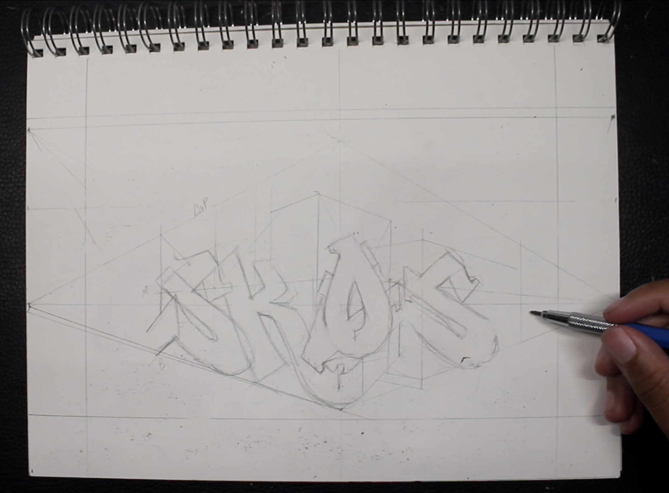
When using perspective for any image, the first thing you want to do is establish your horizon line—this sets the stage for the entire piece. But here's a tip: avoid placing your horizon line directly in the center of your canvas. If you’re new to perspective then placing the horizon line here will make perspective easier to learn, that’s fine for practice however, a horizon line in the center often leads to art that can feel flat and lifeless. By lowering or raising the horizon line just a bit, you add drama and dimension, giving your graffiti a more dynamic feel. That being said, the more you raise or lower your horizon line (HL), the more drastic the effects of perspective will be and this will 100% affect your letters.
Next, set your vanishing points as far apart as possible. The further they are, the more natural and realistic your perspective will be. Trust me, this will make a huge difference when drawing your letter structures.
Building a Cube: The Backbone of Your Graffiti Piece
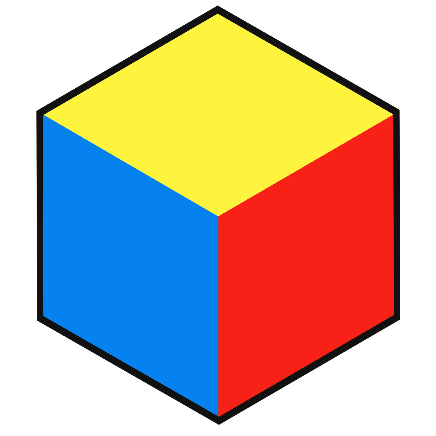
Once you’ve got your horizon line and vanishing points in place, the next step is to draw a cube. We’re going to build our letters inside this cube to ensure that everything stays in proportion. Start by drawing a vertical line to represent the corner of the cube. Then, from each vanishing point, draw diagonal lines to create the sides of your cube. Connect the corners to form an “X” within each face of the cube. Where these diagonal lines meet is the center of the surface, and we can use that center to gain idea of where to place our letters. Not only that we’ll need this center to draw our horizontal line through it to make the meanline. Now with our cube in place, we’ve simultaneously put our cap, mean and baseline into perspective, which will help you place your letters accurately.
Step 2: Integrating Graffiti Fundamentals
Now that the cube is set up, we can start sketching out our letters—starting with the letter “S.” One of the challenges of using perspective in graffiti is that it can drastically change the shape of your letters. Graffiti’s letter structures are often loose and while the structure is important, there’s plenty of luxuries we’re afforded with changing structure. Perspective will strain the letter even before we add style so stylistic changes will hurt fundamentals more than normal.
So, how do we balance this? The key is to prioritize the fundamentals that are the most important, while (when necessary) sacrificing fundamentals that are less important for the art form you’re doing. For example, the most important fundamental for this image is letter structure because we’re doing graffiti. Perspective, form, value, and space all take a backseat to letter structure. Now, we are doing a twp point perspective image here, so all of those other basics are also important. This means we’ll want to include ALL of the fundamentals listed when we can, but the second any of those inhibits letter structure, we loosen up how strict the fundamental is until our letter structure is fine. Think of it as a delicate balance between perspective and the natural flow of graffiti art.
Step 3: Introducing Extensions and Depth
Now, let's talk about adding extensions to your letters—this is where your graffiti really starts to pop. Extensions give letters personality and help fill negative space, but when you're working in two-point perspective, you want to make sure they abide by the perspective lines. For instance, on the back of the "S," diagonal lines converge at a secondary vanishing point, creating a more realistic depth and giving your graffiti a three-dimensional quality.
In graffiti, perspective often conflicts with traditional letter structure, so there are times when you’ll need to prioritize the letters over perspective. To make up for the lost perspective we can begin to implement more of the perspective into our extensions where we don’t really lose anything for doing so. However for this to work, your letters will need a strong foundation in perspective otherwise the extensions will look strange and out of place.
Step 4: Filling in Negative Space
As we continue, pay attention to how you’re using negative space. This is the empty space around your letters that, if handled poorly, can make your piece feel unbalanced. By extending the leg of the "K" under the "O" and connecting it back to the "S," we start filling in those gaps, creating a more cohesive and dynamic composition. Another trick is to use overlapping forms. For example, having the 3D extensions of the "O" and "K" overlap naturally adds depth and eliminates awkward gaps in your piece. Not only that, we took advantage of the 3D extending from the letters to help fill in more space above the letters. Do keep in mind, not all space is bad, and we don’t want to eliminate all of it, we only want to control the space.
Step 5: Bringing in The Shadows and Color
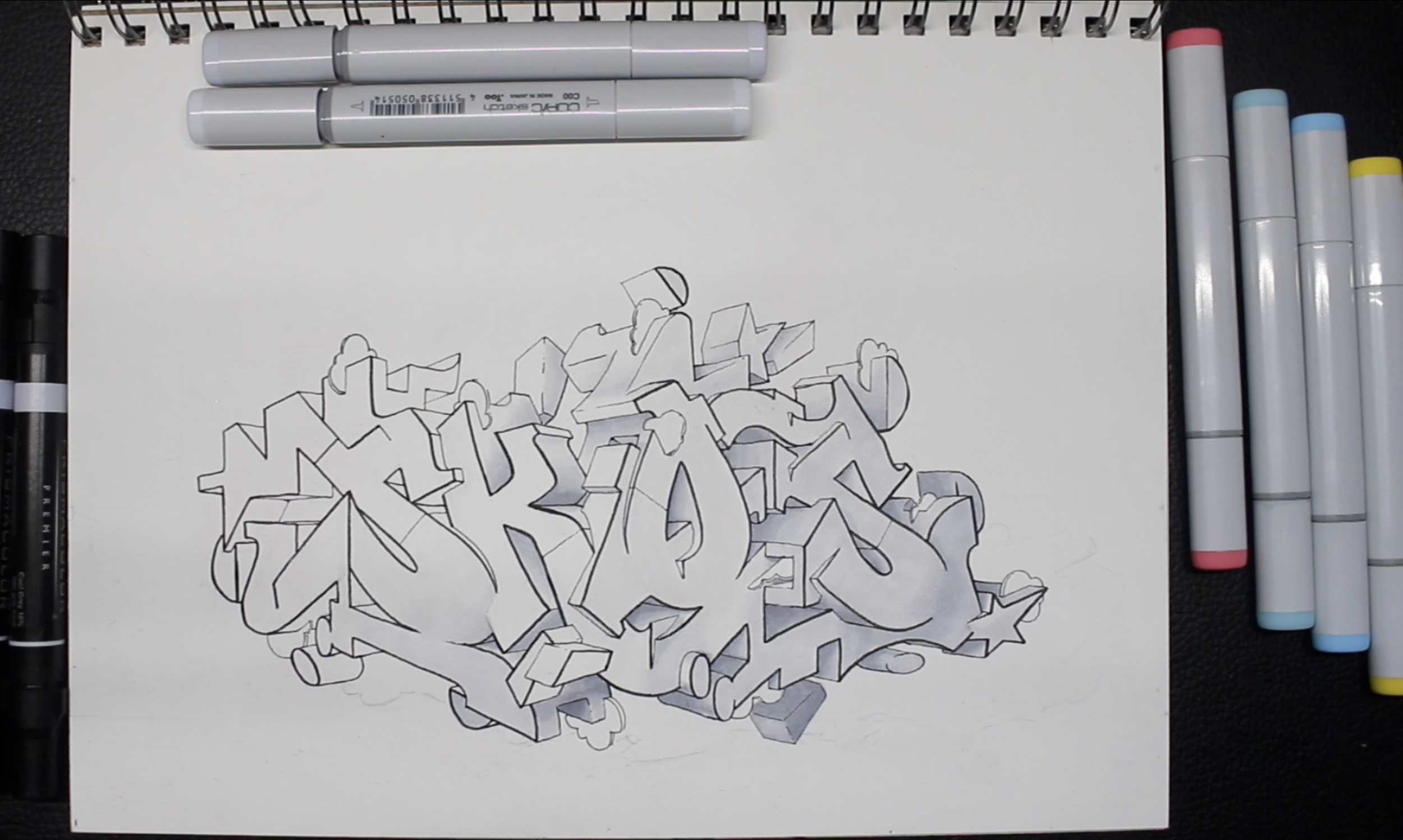
With all the letters locked in, it’s time to bring in your shadows and color. Since we’re using markers we’ll want to be careful with how dark our shadow values get. Dark values not only have more weight but they make it harder for other colors to overlap them and they can even get rid of letter structure if you make them too dark. We’ll want to gradually build our shadows with darker and darker values. Since we’ll be using light yellow in our fill, I’ll keep the values to a 30 or 40% grey. Treat your shading process the same way you’d treat shading a basic form, in other words, sides facing the light will be lighter, and sides facing away will be darker. Thinking of your whole piece in this way makes shading a sinch.
Additional Resources:


