

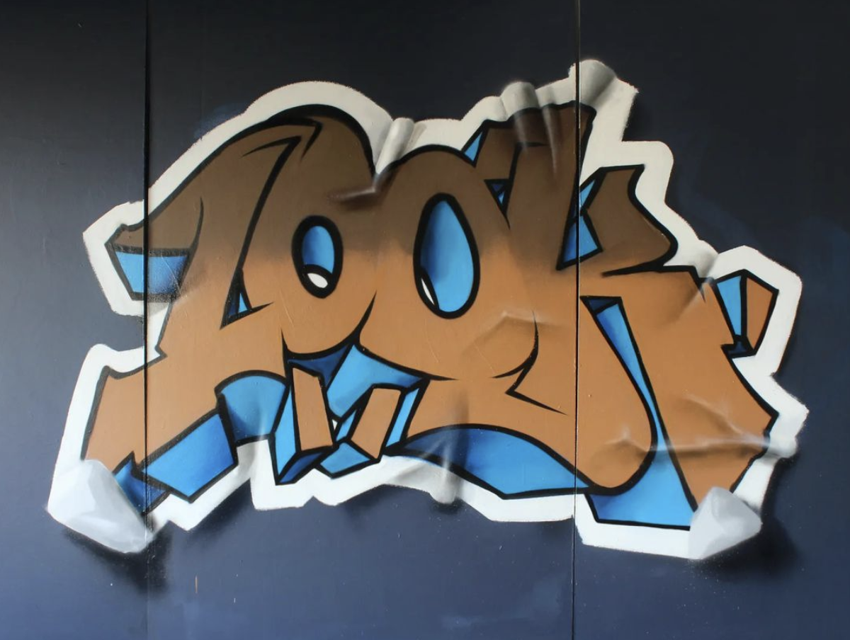
Replace Your Throwie With This!

There exists a certain type of straight letter in graffiti that is used like a throwie and these are something you’ll want to look out for! While these are definitely straight letters, theres a few key differences that define these as their own subcategory. One of the key differences is that these kinds of straight letters have an extremely low style threshold. That doesnt mean that they cant contain style, they certainly can, but the amount of stlye, and the extent in witch you can distort these is relatively low. Normally these are made using only the lines needed to create the base structure of the letter, and thats it. This can even excludes compressed extensions and serifs since details such as these would only lengthen the amount of time it takes to do this kind of straight letter. For this reason, any stylistic changes would take place using other key fundamentals such as changing the proportions of boxes or whole letters, positioning, negative space, flow, or using different base structures. Each of these stylistic options can be implemented as they’re doing the letter without having to add additional details, these changes are baked into the nature of the letter itself.

As a result of this, writers who’ve used these straight letters for extended periods of time have lots of practice making stylistic changes directly too letters without using extensions. For this reason, these writers tend to have more style packed into their more traditional straight letters than the average graffiti artists.
Normally when your average graffiti artists begin doing pieces, their first instinct is to add tons of letter distortions by bending and snapping structure, then they’ll take that and add tons of extensions. As they continue down this path they become used to adding style in this way and while there’s nothing wrong with adding style this way, they arent as used to adding style to the nature of the letter itself. Sure, they can learn this skill as well, it simply isnt an intuitive skill for the intermediate or less practiced artist.


Given the simplicity of these types of straight letters, it’s easy to adapt their size to be really huge, or tiny little pieces that fit well on just about any wall. Given that really you’re only dealing with the core structure, you dont have to worry about the proportions of tiny details or intricate changes. Even seemingly harmless ideas in stylized works such as “how much positive space is in the bowl of my letter” can suddenly become issues when making letters larger or smaller and concerns like this aren’t much of an issue for our simple straights. Probably the biggest point to how versatile these are is the fact that if you find you suddenly have more time you can stack on more details of your choosing, such as 3D, highlights, interior details. This extra bit of effort can make your wall pop just a bit more for little investment from the artist. However, if you’re pressed for time you can still keep it as basic as you’d like and finish with the same relitave speed as a throwie.
On the other hand, an inexperienced artist risks magnifying their mistakes when using these. Since we’re doing a straight letter, there’s an emphasis on “basic boxes”, so any mistakes aligning your structure will be clear to see. Other fundamentals aren’t safe from this either, as things like negative space, weight, positioning and flow are going to be front and center for everyone to judge. Throwies typically handle negative space, weight and positioning for you since their larger, fatter, wider structures tend to layer over one another.
I think it’s worth saying, using straight letters as throwies is not at all necessary, but if you’ve tried to learn throwies, and you find you dont enjoy them, then you can use these as a good replacement. With that said, each and every artist should do their best to learn throwies even if only to lean what throwies have to offer as far as lessons go. Taking time to learn each form of graffiti is not only worth it but it’s the only way to gain a full understanding of the art form. Learning each form takes time as well, patients is important. Too many people spend a year or two and fail at throwies then think “oh i simply dont like throwies, Im not going to bother”. It normally takes writers years to learn these topics and tons of practice, spending a few years is simply not enough to get the payoff many are looking for.