

Contrast Your Graffiti!
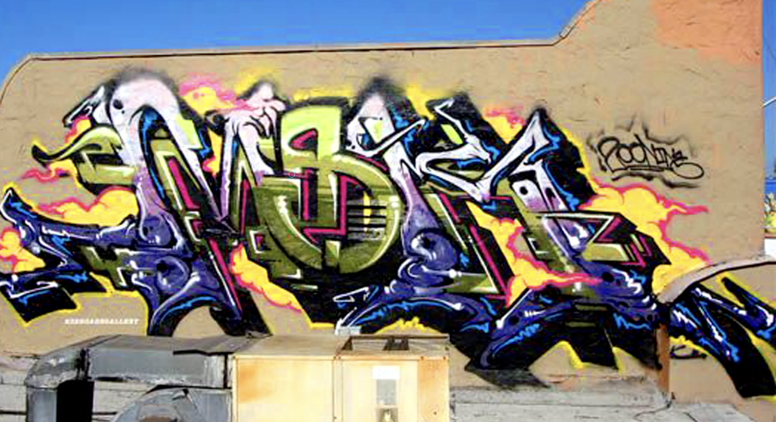
Every now and again, you just want to mix up your graffiti art work with something extra flashy, and you dont always know how. Well, using a bit of contrast we can make a letter just about explode off of a wall. This is a great way to mix up your piece with a letter that stands out among the rest of them, and in more advanced applications you can make each letter different from one another while still keeping flow. Ok, so the goal here is to create a letter that looks nothing like any of the other letters in our piece. When we do this, we’re going to lose tons and tons of flow in the process due to the high contrast. Our goal is to counter this by compensating for flow. Compensating for this should be easy enough for any graffiti artist who’s familiar with the basics. We can focus our efforts on the different properties of flow to ensure we have enough flow to sacrifice for contrast. In the MSK piece above, we see this very technique executed beautifully. This is a pretty basic example of what can be done when you make a letter contrast, however, this can be done with great effect in wild styles.
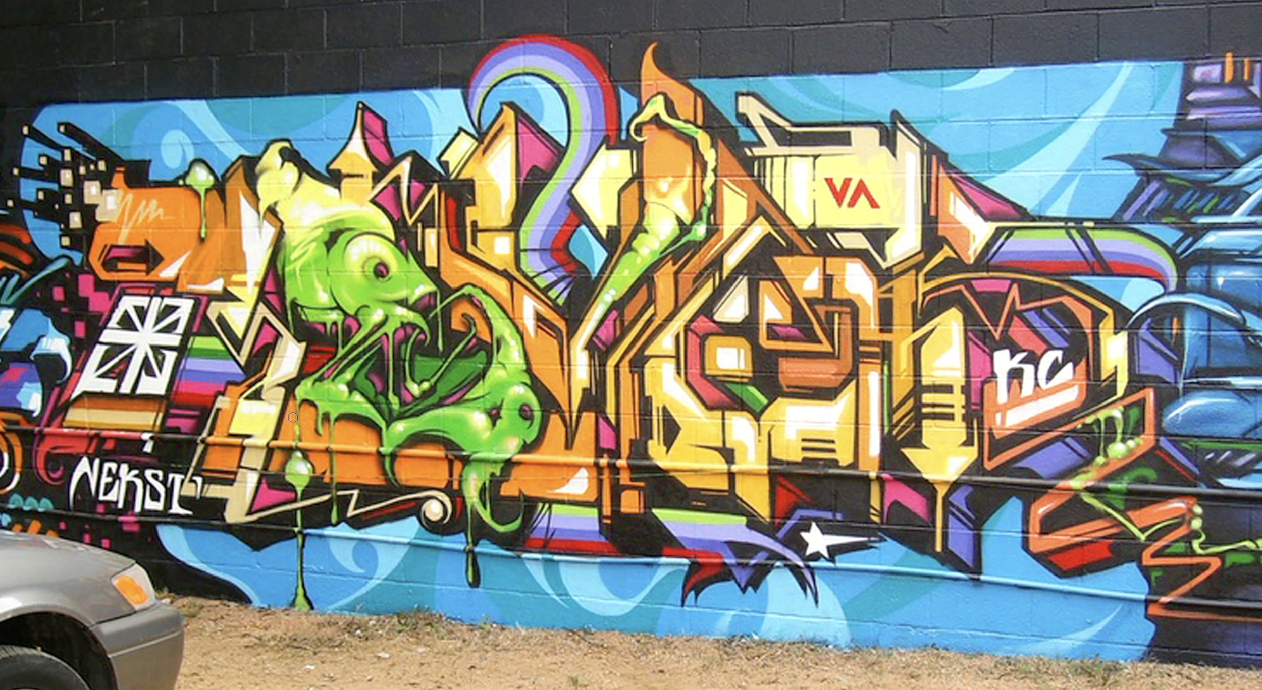
In this Revok piece we can see the letter E in green stands out against all of the other letters. The color isn’t the only method of contrast though, his E features much more rounded and organic looking shapes, as to where the other letters have a more angular harsher shape to them. However, despite these differences, you’ll notice letter similarities throughout the letters (even the E). Line uniformity isnt used all too much here, so most of the flow is coming from letter uniformity. Here’s the kicker, what makes this technique so great is that you can lean fully into this and force a letter to not flow at all! Given what we established earlier about compensating flow, if we delve all in, then we dont have to build positive flow to negate the negative impact on flow from contrast. We can isntead make it perfectly clear and apperent that we dont want the letter to fit in, doing this will drastically increase letter weight. To compensate for this we could resort to many fixes, but for this, we’ll settle for making the ltters smaller. Shortening the letter will lessen the weight, while the contrast will increase the weight and by the end of it, we could end up with something like Boogie’s piece.
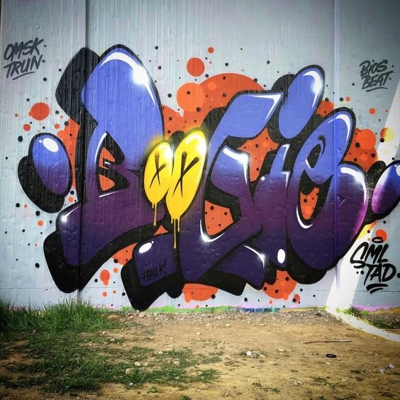
Despite the fact that the both Os are tiny, their presence commands attention and results in these letters being heavier than all of the others. Notice, the Os also use an X for their closed counters rather than establishing their closed counters in the same way the B and E do. This farther lessens the uniformity between the O and other letters. Boogie leans all the way into this technique making both O’s very different from the other letters and as a result this piece looks amazing!
If there’s one thing I’d like to leave you with is the understanding that you can do whatever you’d like with this technique. There are so many variables, and ways to contrast to where the possibilities are truly endless. However, as with anything in regards to style, the fundamentals have to remain correct by the end of it all otherwise you didn’t add style, but rather you’ve added mistakes. The game of style is a game of compensating, and making trades. You gain a bit of one fundamental here, and lose a little of something else, this is what happens when you add style. If you dont know the fundamentals, then you cant make effective trades, and you fail to compensate, witch causes you to lose all fundamentals while gaining nothing.