Why Your Extensions Don't Work!
Often times what seperates a decent graffiti artist from a great one is a simple change of mindset. Today we’re looking at some graffiti from you guys and we’re starting off with Lacks, an amazing writer who’s ready to take their work to the next level.
Lack
Lack shares a straight letter that they use as a throwie. These are done from time to time by some writers, and when something like this is done, the straight letter is kept as simple as possible, normally as a result of focusing on speed and utility that way the writers can use a more structured, stylish lettering to get up. However, Lack has a legitimately good throwie, one that is pretty advanced and really well done, meaning they don’t need to use a straight letter like a throwie. Lack is so close to taking their work to the next level, so close to pushing past their current skill cap, and to get there I recommend they focus on developing their straight letters more. If you have the time to do a straight, then dedicate the time to it and develop those structures! Explore more of those fundamentals and push your straight letters away from that throwie utility. Something as simple as this will help give Lack more range as well.
Frost
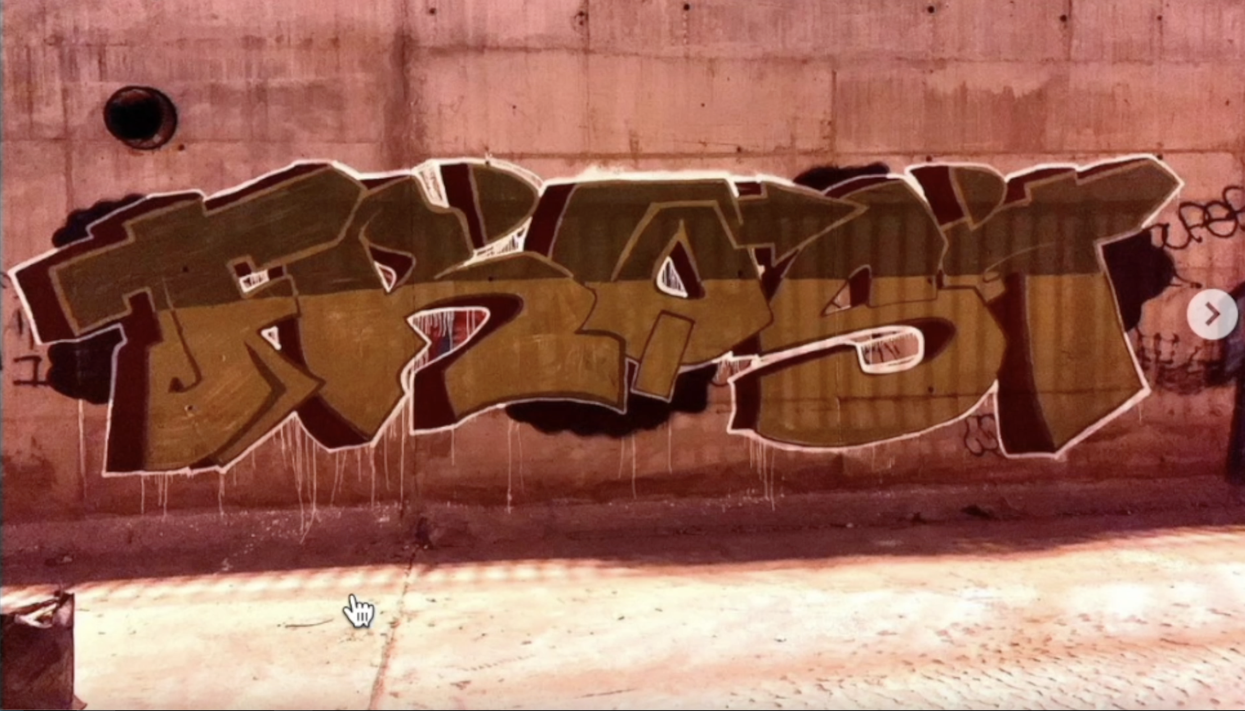
Frost has themself a piece with plenty of style and extensions. The key to extensions is to number one, understand they’re a detail and all details are useless by nature, and number two, you need to understand the anatomy/formula to extensions. Extensions have their origin, travel distance, and the destination. An extension must flow from its origin, and have a fundamental reason for it’s travel distance and flow at the destination. Having all three of those qualities ensures your extension will work, and while possible, having two or one of those reasons makes the extension harder to pull off successfully. These extensions normally flow out of the origin but often don’t flow at the destination, and never have any fundamental reason for travel distance. They also don’t occur enough times and as a result they take away from flow. Since details are useless by nature, we want to give them a fundamental reason to exist so they don’t hold back other fundamentals, and instead, they augment and help other basics. This is what Frost can improve on after studying letter structure and flow a bit more.
Andee
Andee has a similar issue with his extensions that Frost had before, both suffer from extensions that don’t flow or have a fundamental reason to exist. However Andee pulls off his AN letter combo really well, and he does this by having both letter’s fundamentals play off of one another. See, the N is short and doesn’t reach the baseline, alone this would be a fundamental issue. However, he intentionally blocks the N with the A’s structure meaning that now the N has a fundamental reason not to reach the baseline other than simply being too short. Now the A has to provide a fundamental solution for the N, and he does this by putting a serif on the A that goes right under the N to help hold the N up meaning the N is now perfectly fine where it is. As far as what they can improve on, they’ll want to study letter structure, negative space management, and flow.
Tasko
Tasko is one of those artists who’ve reached that next level with their art so they know the fundamentals well, and as a result they won’t have overarching mistakes that are so easily seen. Their improvements will have to be small adjustments to their work that will cause huge effects, for example, propper highlights and more occlusion shadows. Right now this piece has a white highlight effect but these white areas don’t really adhere to a uniform light direction. If they aren’t meant to be a highlight then make that more clear, communicate your designs with clarity. If they are meant to be highlights then they have to abide by a proper light source. Next up, his pieces are often one color without much going on in the fill-in. This is perfectly fine to do, in fact, I find myself going that route with many of my own pieces. The issue with this though is that your letters can begin to lose contrast, and they don’t stick out as a result. To help pull the letters back out add occlusion shadows. This is a simple way to add depth, and help your fill-ins look less one tone.


