How to Get Better Graffiti Throwies!
Are you interested in graffiti throwies and looking to improve your style? Graffiti throwies – quick, stylized, bubble-like lettering – are a popular and iconic form of graffiti, and arguably one of the most important. They might look simple, but mastering the flow, structure, and balance in a graffiti throwie takes practice and attention to detail.
In this post, we’re diving into some essential tips on how to do graffiti throwies that flow, based on real feedback from rating different graffiti artists’ throwies. Whether you’re new to graffiti or refining your craft, this guide is packed with insights to help your throwies stand out.
Yukz
One of the first throwies we reviewed was from Yukz, a challenging combination of letters for any graffiti artist. Letters like these can disrupt the flow due to their unique shapes. that have most of their structure on the left-hand side. This creates problems because normally the left of the letter is the side that gets overlapped, making it easy for letters like Z to lose structure from the overlap. Leaning letters, or making sure your letters are wide enough can help mitigate this issue.
Tip: When working with complex letters, focus on consistency. Try to maintain similar shapes, curves, or edges throughout your throwie. For example, if most of your letters have rounded edges, avoid sharp points unless it’s intentional. This consistency brings a cohesive look to your throwie, making these difficult letters feel more balanced.
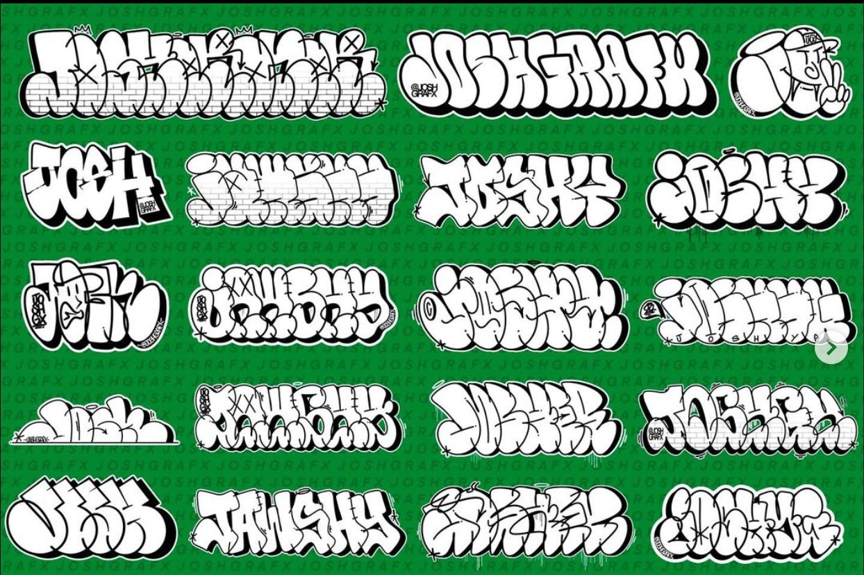
Josh
We follow that up with Josh, a good friend of ours and someone who has amazing throwies! First, let me start by saying his throwies are fundamentally sound, and he’s looking to take his work to the next level! This means we’re going to chat a bit about some fundamentals he can explore more, not necessarily what he’s messed up. That being said, id recommend looking into negative space management, and letter name positioning more. These are two things that you don’t commonly see messed with in throwies, and if you do, it’s to a very limited extent. From there it’s always a great idea to study and practice the elements of art. This topic alone has the power to change your throwies overall, so adding this to your studies is never a bad idea.
Tsar
Tsar shows us a basic straight letter he’s working on and what I really enjoy about this one is his use of the basic boxes! When we see people learning and practicing their basic boxes it’s a good indication that they’re starting to move in the right direction and focus on what matters, the basics. To help improve this Tsar can unify the width of his basic boxes. Now doing something like this will always have an effect on other fundametnalas, so be ready to make other changes. The width of your boxes can change the negative space in and around letters, and as a result, it might force you to change position of letters. As you can see in our draw over, I kept the letters the same for the most part, but most of the changes actually came from the positioning and space.
Puri
Puri has himself a really nice throwie here with not much to really harp on without making a whole new throwie, so this critique is going to be pretty straightforward. They’ve added a very prominent hairpin curve on the P and normally this is done for utility, making the letters after to do. However, they’ve only added it once, and there are plenty more areas this could have been implemented. I’d recommend either adding it in more spots that make sense, or simply don’t have it on the P.
4CA
Has a pretty good throwie as it is, but the first letter is meant to be the number 4 rather than a letter. Numbers are tricky because they arent used as frequently as throwies so unless your number is unmistakable then people will first think of a letter. Its important that our numbers have clear and refined structures as a result of this. Here in the draw over, we really don’t need to change the last two letters, so instead let’s demonstrate what a simple base structure 4 would look like. I want to be clear, base structures are letters that EVERYONE can use and it’s not considered copying so he’d be able to use this 4 as it is if he wanted. We also did a more stylized version just because I enjoyed the name.
Soul
Soul had a great piece here with lots of interesting ideas! For one, he decided to position the U and L in an unorthodox way that could have really worked out well. He also added some nice shading to the letters to help add depth. Due to some issues with box thickness, and positioning, his letters had this weak look to them that lacked structure but also confused some structure around the points where letters connected. I the draw over, we refined the width of his boxes, and we repossessed some letters too. These simple changes resulted in stronger and more clear structures that were easier to see.


