

(Step By Step) Guide To Drawing Graffiti!
Starting Your Sketch
Are you eager to learn how to create amazing graffiti art? Whether you're a beginner or looking to refine your skills, this guide will walk you through the process of building a letter structure from scratch. Today, we'll use the letter "R" as an example, but these techniques apply to every letter in any language. Before we dive in, make sure you're familiar with graffiti fundamentals, as we'll be adding style to our letters.
Choosing Your Base Structure

First, think about the name you want to turn into a piece. Select from different basic and variant structures. We'll use three different "R" structures:
Three-Box R: This includes a stem on the left, a bowl, and a leg.
Four-Box R: Features a rounded bowl, a stem, and a two-box leg.
Four-Box Triangular-Bowl R: A one-box stem, a triangular bowl, and a one-box leg.
For our tutorial, we'll choose the Four-Box R. As you can see, the letter R has plenty more structures to choose from, and many letters are like this. Some letters feature plenty more base structures while some feature only a few, be sure to pick the one that fits your needs best. If you’d like a full list of variant structures, be sure to check out our newest book, The Ultimate Graffiti Guide Book Part 1-Fundamentals.
Setting Up Your Lettering Chart
Place your chosen structure on a lettering chart, which includes:

Baseline (B): A line where the bottom of your letters will stand on.
Cap Line (C): A line where the tops of your letters will reach.
Mean Line (M): A line that divides the letter in half.
For our R, the bowl connects half above and half below the mean line, ensuring proper negative space in both the closed and open counters of the letter. All letters can fit within this lettering chart, and you’ll find that the chart works the same for each letter. The baseline will still be where your letters rest, then your letter will reach the capline, and be split in half at the mean line.
Adding Style and Adjustments

Now that you have your basic structure, let's add some style:
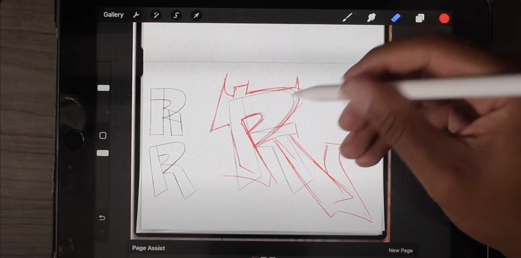
Tilt and Taper: Tilt your letter to the left and taper the stem to add dynamism. The top should be thinner than the bottom.
At this point we’ve only messed with letter positioning and we’ve added slight changes to letter structure. Often, new artists think style happens with just the structure, and they don’t realize style happens with each individual fundamental. Try to make small changes to a few, or each fundamental to see how it changes your letter. You’ll quickly find that small changes to a few fundamentals is often better than one change to just structure.
Playing with Concepts
Experiment with different ideas to adjust the letter's structure:
Extrusions: Extend parts of the letter past their normal boundaries. For example, continue the bowl past the stem.
Serifs: Add extra strokes to the ends of your letter parts.
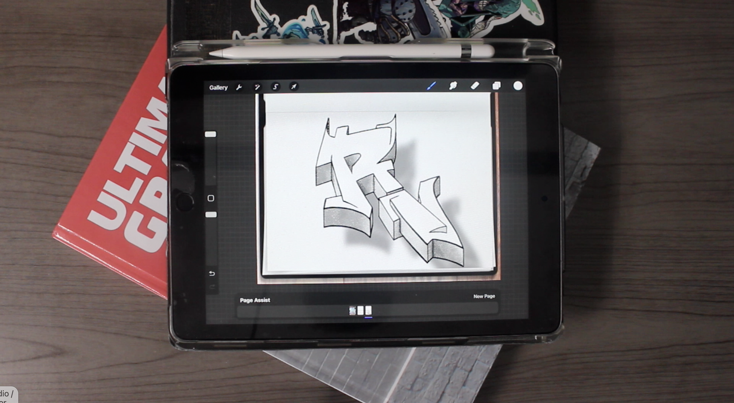
Finalizing the Design
As you refine your R, consider its overall balance and flow. Incorporate extrusions, serifs, and any other stylistic elements that enhance the letter without distorting its fundamental structure.
Conclusion
Creating graffiti art involves a mix of understanding basic structures and adding personal style. By following this step-by-step guide, you can develop a strong foundation for any letter and experiment with various artistic techniques.
If you want to dive deeper into graffiti fundamentals and learn about variant structures, check out our new book available in both ebook and physical formats. For more in-depth tutorials, visit our YouTube channel and explore our extensive playlist. Happy sketching, and stay creative!