

5 Throwie Techniques Every Graffiti Artist Should Know!
When it comes to graffiti, mastering your throwie is essential. It’s one of the most recognized and fundamental graffiti styles, allowing artists to get their name up quickly while showcasing their unique flair. In this blog, we’ll be sharing five tips to instantly improve your throwie. Whether you're new to graffiti or looking to refine your skills, these practical tips will help you elevate your throwies.
1. Focus on ONE Shape
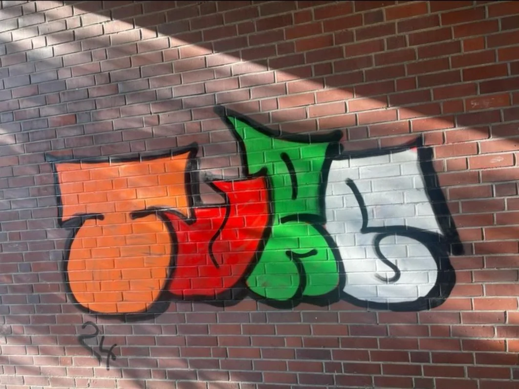
One of the most common mistakes graffiti artists make with their throwies is a lack of cohesiveness between the letters. It’s easy to get carried away with combining different styles—sharp, boxy edges with soft curves—but this can make your throwie look inconsistent and fragmented. Now to be clear, this certainly can be done, and it’s not all too difficult assuming you have some experience, but for newer artists, this can be a difficult challenge. To avoid this, focus on a single stylistic motif for your letters. For example, if you're using rounded edges for one letter, try to apply that same curvature throughout the entire throwie. Maintaining similar shapes and flows between letters will result in a more cohesive, professional-looking throwie. In Turc’s throwie we see them attempt a mix of both, but the issue here is that they’re still learning not only graffiti, but general art as well. This learning curve is causing them to juggle too many fundamentals at once and it’s causing mistakes in their work as a result.
2. Dig Your Lines Deep for Structure

One of the easiest ways to create a dynamic and structured throwie is by digging your lines deep into your letters. As seen in some of the best throwies from artists like Dreso, deep, well-placed lines help build multiple aspects of a letter's structure.
For example, in the letter "R," a single vertical line can define not only the left leg but also the top and bottom portions of the right leg. This gives your throwie strong structural integrity, making it look bold and intentional. Lines like these also allow you to distinguish multiple areas of your letter with fewer lines. This means that using lines in this way will indirectly speed up your throwie as well.
3. Use Drawn-Through Lines
One often overlooked technique for improving your throwies is the use of drawn-through lines. These are lines that pass through overlapping objects, helping to depict structure we couldn’t otherwise see. However, it’s important that these lines don't interfere with the other letter's structure.
In Dreso’s throwie, for example, a line from the letter "E" goes through the letter "R" without disrupting its form. This line actually enhances both letters, adding depth and unity. When used correctly, drawn-through lines can add a sense of movement and connection that elevates your throwie from good to great.

4. Simplify Without Sacrificing Style
A common pitfall for newer graffiti artists is overcomplicating their throwies. Remember, a throwie isn’t meant to be as intricate as a full-blown piece—it’s about speed and visibility. Simplify your design to make it clean, legible, and effective. But simplicity doesn't mean boring.
Take cues from graffiti artist Scope, who uses simple, clean lines and keeps his throwies minimalistic while still maintaining style and uniformity. By focusing on the essential elements of your letters and maintaining consistency, you can achieve a throwie that’s impactful without being cluttered.
5. Practice Clean Lines and Shapes
This tip can't be emphasized enough—clean lines and well-defined shapes are crucial for an eye-catching throwie. Graffiti throwies are about fast execution, but rushing your lines will result in a messy, unpolished final product. Prioritize control over speed to get those sharp, clean edges and rounded curves where they’re needed.
When you practice, focus on nailing down the basic shapes of each letter before you start adding style. Once you're comfortable with the fundamental letterforms, you can build up to more complex throwie designs. If you want to take this even further, referencing traditional letter structures rather than someone else's graffiti work can help you create a more unique and personal style.
One of the most important skills for any graffiti artist to master is the graffiti tag, the signature or handstyle that represents them. In this post, we’ll take a look at five of the best graffiti tags as suggested by the community and explore what makes these artists stand out.
Additional Resources:
Comprehensive Graffiti Book: Available in ebook formats here.
YouTube Tutorials: Check out our playlist for the best how-to graffiti tutorials.
Feel free to share your thoughts and share other people with dope tags in the comments below!