

Dont Make This One Mistake in Graffiti
Every so often we take submissions from you guys over on Instagram and we give your graffiti a rating on a scale from 1-10 while also giving a few tips and tricks on how to improve your graffiti. We just released the latest video in our rating series which you can check out here. "Dont Make This One Mistake In Graffiti - Rating Fans Graffiti”.
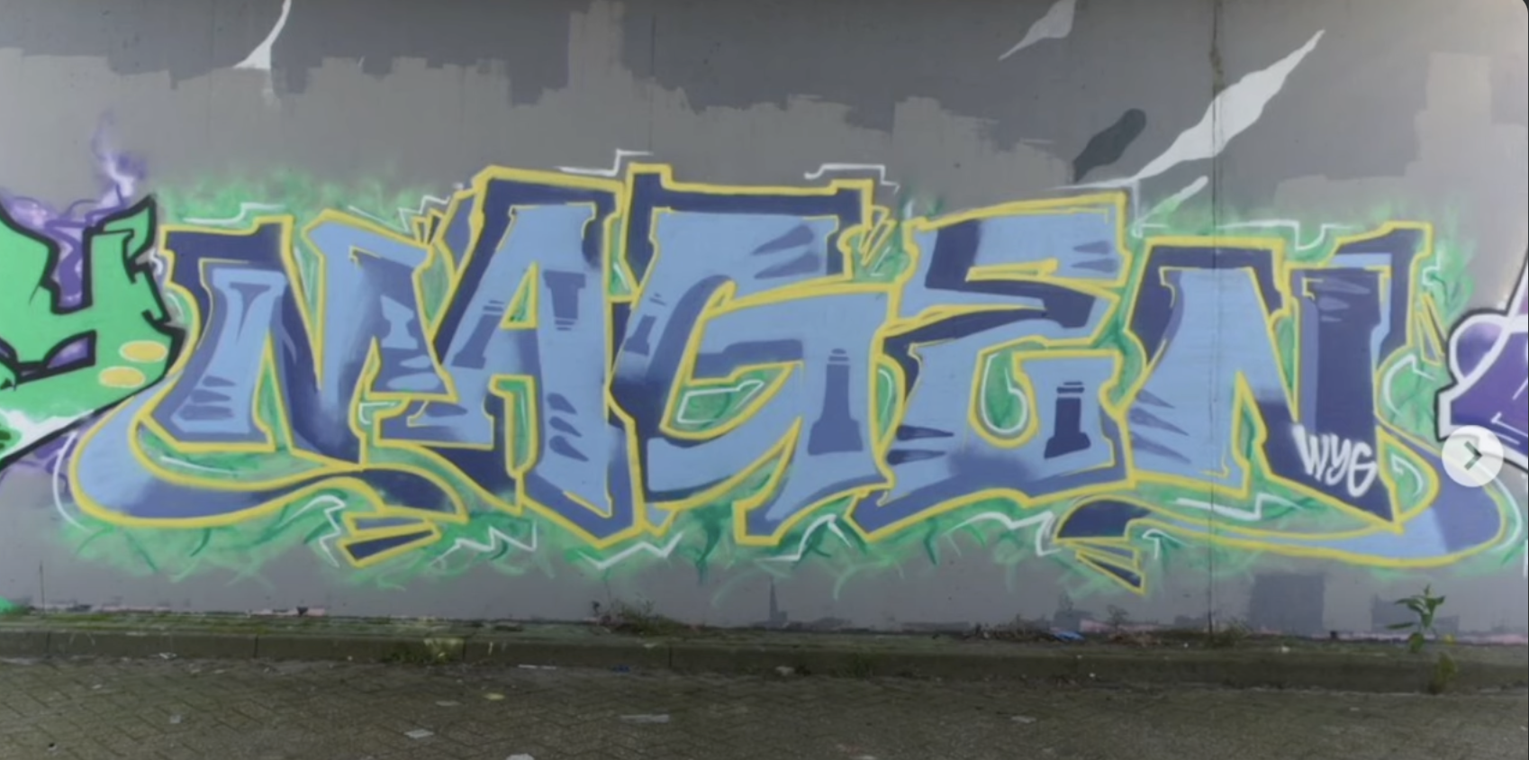
Our first submission was an awesome wall done by Magen, and he really did a great job but a few things stood out to me. One of the more notable topics was his extensions, and they stood out for a few reasons. Not only did his super round extensions feel out of place in an angular piece, but the width of these extensions varied greatly! Each extension gets overly thin for how bulky the overall piece is, and this sudden change in width creates tons of contrast and ultimately diminishes flow by a ton. When you consider ontop of that, the extensions don’t really serve any fundamental purpose despite having huge travel distances, suddenly you begin to realize the extensions don’t fit the piece.
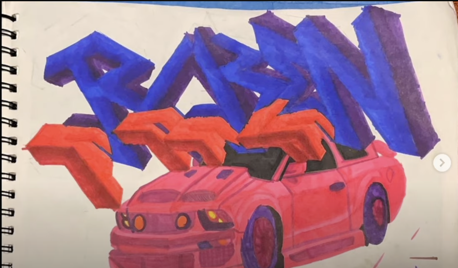
Next up we have a 3D piece, and this one we didn’t really talk much about in regards to the work itself, rather we spoke about different topics they’d need to study to learn 3D graffiti. This piece in particular is a solid attempt at the advanced style but misses the mark with all of the more realistic fundamentals needed to pull this off. Realism depends heavily on form and space. Often times we try to shade these forms to depict the space each form takes up and this requires value as well as the previously mentioned fundamentals. Each of these will have drastic impacts on graffiti’s fundamentals and change how the letters function. Its the artist’s job to not only maintain graffiti’s fundamentals under this influence of the new basics, but they also have to successfully use the new fundamentals as well. This piece in particular struggles to shade it’s forms with a cohesive light, and it struggles to consider the volume and space of each form. A good attempt none the less.

From there we move to the tracks where we have ourselves a simple and clean piece. Nothing too fancy here, just a good old piece with good fundamentals, and a splash of funk with the rounder edges. Pieces like these tend to encompass plenty of space, and he made good use of the space with bold, larger letters. Also, when doing work on this scale, letters tend to be spaced a little farther apart than the average piece and he kept his space nice and consistent, certainly a nice and simple piece.

Lugn similarly did a black and white piece but his comes with a bit of a twist! Using black and white spray paint he alternates between them to both outline and fill in the letters! He does a great job making sure to suggest letter structures and making sure to not have one color touch the same color on a different letter. Lugns ability to control his black and white fill was the secret to pulling this piece off. He did end up losing the left side of the G, but that wasn’t due to the colors, rather due to the close positioning with the other letters. This does take a few points away as letter structure is the most important of graffiti’s fundamentals, but the creativity of the piece as a whole is just too cool to harp on the mistakes that much especially since you can still make out the G.

Lastly we have an amazing piece from Kewz, and this one breaks my heart! It truly is a great piece and we can see the undeniable skill kewz has but there is one critical error. That error is one point perspective, a basic technique that absolutely no advanced graffiti artist let alone intermediate artist should be getting wrong. One point perspective is a basic arts technique where lines receed into a vanishing point located on a horizon line. When doing graffiti on walls we allow for a small margin of error with perspective as it can be hard to get a line exactly to a vanishing point over such a large distance and scale. Something like this is more of an application mistake, a mistake the artist wouldn’t have made on paper where they could easily reach the vanishing point with one stroke. However, shooting the 3D in the completely wrong direction is more of a knowledge mistake and an easy one to fix. We actually have a book that teaches all about one point perspective and applies it to graffiti so if you’d like to avoid making this same mistake, pick up the bundle book.
If you’re looking to learn the basics of graffiti then check out our brand new book The Ultimate Graffiti Guide Book Part 1-Fundamentals where you’ll learn all of graffiti’s basics in an easy-to-follow book. By the end of it you’ll fully understand how to find your style, and how to keep progressing for the rest of your graffiti journey.